# Welcome

Welcome to the Savvy Builder documentation! Here you'll find a growing library of guides, references, tutorials, concept explainers, and FAQs.

We at **Savvy** believe in the power of **no-code** to democratize software development and **empower anyone** to bring their ideas to life **without technical barriers**. \
\
Whether you’re a seasoned developer or a complete beginner, **our docs will help you get the most out of Savvy Builder** and unleash your creativity to build powerful and fully custom projects.

## Guides

Get started quickly with these three key guides to the builder:

<table data-card-size="large" data-view="cards"><thead><tr><th></th><th></th><th data-hidden data-card-cover data-type="files"></th><th data-hidden data-card-target data-type="content-ref"></th></tr></thead><tbody><tr><td><strong>Intro to the Builder</strong></td><td>Short description of the sidebar from top to bottom.</td><td><a href="https://2080030610-files.gitbook.io/~/files/v0/b/gitbook-x-prod.appspot.com/o/spaces%2FgFafh00YOojEhbybq4uG%2Fuploads%2FoiM8iVIe2C50ZQga1LYV%2Fbook%20upload.jpg?alt=media&amp;token=39c88eef-8312-470f-8baa-93c238624f61">book upload.jpg</a></td><td><a href="/guides/intro-to-the-builder">Intro to the builder</a></td></tr><tr><td><strong>Designer Card</strong></td><td>Quick guide to get started into styling flow components.</td><td><a href="https://2080030610-files.gitbook.io/~/files/v0/b/gitbook-x-prod.appspot.com/o/spaces%2FgFafh00YOojEhbybq4uG%2Fuploads%2Ffg3VmNq6TmIQ9UP935xz%2Fpage.jpg?alt=media&amp;token=c01890d9-7da7-40fa-ad8c-2bebc1d451a4">page.jpg</a></td><td><a href="/guides/designer-card">Designer Card</a></td></tr><tr><td><strong>Working with Logic</strong></td><td>How to use functions on the builder.</td><td><a href="https://2080030610-files.gitbook.io/~/files/v0/b/gitbook-x-prod.appspot.com/o/spaces%2FgFafh00YOojEhbybq4uG%2Fuploads%2FEZlBCiCfK3PoxovxKCel%2FLogic.jpg?alt=media&amp;token=0c035b2b-3655-4ab4-846b-96d63b282448">Logic.jpg</a></td><td><a href="/guides/working-with-logic">Working with Logic</a></td></tr><tr><td><strong>Options Card</strong></td><td>Quick guide to get started into setting components options</td><td><a href="https://2080030610-files.gitbook.io/~/files/v0/b/gitbook-x-prod.appspot.com/o/spaces%2FgFafh00YOojEhbybq4uG%2Fuploads%2FmlkVNTQePcABSZZ5D63t%2Foptions.jpg?alt=media&amp;token=0e1f9b25-0301-43e9-a347-f50122c9a4ad">options.jpg</a></td><td><a href="/guides/options-card">Options Card</a></td></tr></tbody></table>

## How-To's

Short tutorials for achieving a specific task:

<table data-view="cards"><thead><tr><th></th><th></th><th data-hidden data-card-target data-type="content-ref"></th><th data-hidden data-card-cover data-type="files"></th></tr></thead><tbody><tr><td><strong>Show/Hide Conditions</strong></td><td>How to set a show/hide condition</td><td><a href="/how-tos/logic-how-tos/how-to-set-show-hide-conditions">How to set show/hide conditions</a></td><td><a href="https://2080030610-files.gitbook.io/~/files/v0/b/gitbook-x-prod.appspot.com/o/spaces%2FgFafh00YOojEhbybq4uG%2Fuploads%2FGxod7av4GOeWGIyKBDVj%2FScreenshot%202023-04-07%20at%2010.24.52%20AM.png?alt=media&amp;token=5f02625e-aaf2-4d32-ad1d-78ca1311d2a9">Screenshot 2023-04-07 at 10.24.52 AM.png</a></td></tr><tr><td><strong>Templating</strong></td><td>How to display a value previously entered by the user</td><td><a href="/how-tos/logic-how-tos/how-to-display-a-value-previously-entered-by-the-user">How to display a value previously entered by the user</a></td><td><a href="https://2080030610-files.gitbook.io/~/files/v0/b/gitbook-x-prod.appspot.com/o/spaces%2FgFafh00YOojEhbybq4uG%2Fuploads%2Fgaq2Eoh92uMBpyQn9EhC%2FScreenshot%202023-04-07%20at%2010.31.22%20AM.png?alt=media&amp;token=29826042-d31e-48b0-9af1-6f488724651d">Screenshot 2023-04-07 at 10.31.22 AM.png</a></td></tr><tr><td><strong>Styling components</strong></td><td>How to style components (basics)</td><td><a href="/how-tos/design-how-tos/how-to-style-components-basics">How to style components (basics)</a></td><td><a href="https://2080030610-files.gitbook.io/~/files/v0/b/gitbook-x-prod.appspot.com/o/spaces%2FgFafh00YOojEhbybq4uG%2Fuploads%2FWYjWsSMDvmDng5tDFjOI%2FScreenshot%202023-04-07%20at%2010.32.38%20AM.png?alt=media&amp;token=a700140d-6fd4-45aa-9f70-558d30a0cf10">Screenshot 2023-04-07 at 10.32.38 AM.png</a></td></tr><tr><td><strong>Using G Fonts</strong></td><td>How to install a Google font</td><td><a href="/how-tos/general-how-tos/how-to-install-a-google-font.">How to install a Google font.</a></td><td><a href="https://2080030610-files.gitbook.io/~/files/v0/b/gitbook-x-prod.appspot.com/o/spaces%2FgFafh00YOojEhbybq4uG%2Fuploads%2FORm91eJbTss1ECKZl1sn%2FScreenshot%202023-04-07%20at%2010.19.48%20AM.png?alt=media&amp;token=0996a29b-cda8-4f4e-b264-77b63d5bd5d6">Screenshot 2023-04-07 at 10.19.48 AM.png</a></td></tr><tr><td><strong>Moving components</strong></td><td>How to change a component's location</td><td><a href="/how-tos/design-how-tos/how-to-change-a-components-location">How to change a component's location</a></td><td><a href="https://2080030610-files.gitbook.io/~/files/v0/b/gitbook-x-prod.appspot.com/o/spaces%2FgFafh00YOojEhbybq4uG%2Fuploads%2FYcbaOtGh4hsDQ7yTDg9I%2F2023-04-10_13h57_57.png?alt=media&amp;token=cc56aa96-c0aa-40a4-8571-ae6d041838e8">2023-04-10_13h57_57.png</a></td></tr><tr><td><strong>Setting Selectors</strong></td><td>How to style a specific component element (E.g. buttons image)</td><td><a href="/how-tos/design-how-tos/how-to-style-a-specific-component-element-e.g.-buttons-image">How to style a specific component element (E.g. buttons image)</a></td><td><a href="https://2080030610-files.gitbook.io/~/files/v0/b/gitbook-x-prod.appspot.com/o/spaces%2FgFafh00YOojEhbybq4uG%2Fuploads%2FU7rnDAKW8g6qmT8TGRlF%2FScreenshot%202023-04-07%20at%2010.27.01%20AM.png?alt=media&amp;token=afc24fd0-6569-40a4-be17-36f12cf592ac">Screenshot 2023-04-07 at 10.27.01 AM.png</a></td></tr></tbody></table>

{% hint style="info" %}
The above are just some of the most popular how-tos.\
Below you'll find links to the 3 main sections where you can find tons of other how-tos.
{% endhint %}

## How-To's sections:

{% content-ref url="/pages/XBUR4nDT5vq5ximgyDYU" %}
[Design How-To's](/how-tos/design-how-tos)
{% endcontent-ref %}

{% content-ref url="/pages/ijS1SFcgxwO3o0wJmZhs" %}
[Logic How-To's](/how-tos/logic-how-tos)
{% endcontent-ref %}

{% content-ref url="/pages/3vz5029KElhSbAzNFdak" %}
[General How-To's](/how-tos/general-how-tos)
{% endcontent-ref %}


# Intro to the builder

In this section, you'll find a short description of the sidebar from top to bottom!

## Embeddables sidebar:

{% @arcade/embed flowId="nHxqUjjEnaxfYHqyVaQD" url="<https://app.arcade.software/share/nHxqUjjEnaxfYHqyVaQD>" %}

## All Builder Options:

<table><thead><tr><th width="117.66666666666669">Icon</th><th width="174">Name</th><th>Description</th></tr></thead><tbody><tr><td><img src="https://2080030610-files.gitbook.io/~/files/v0/b/gitbook-x-prod.appspot.com/o/spaces%2FgFafh00YOojEhbybq4uG%2Fuploads%2FgwV9tUnsBbn7moYIGV7g%2FGroup%20181.jpg?alt=media&amp;token=db378538-4cd6-463a-886a-317d0bafbfc9" alt="" data-size="original"></td><td><a href="#version-control">Version Control</a></td><td>Save, push live or to staging, view, and switch versions.</td></tr><tr><td><img src="https://2080030610-files.gitbook.io/~/files/v0/b/gitbook-x-prod.appspot.com/o/spaces%2FgFafh00YOojEhbybq4uG%2Fuploads%2F80yjQo520ckAlUEjFtMn%2FGroup%20152%20(1).jpg?alt=media&amp;token=566d929a-0362-479f-8345-29f237af5a05" alt=""></td><td><a href="#add-button">Add</a></td><td>Add components, layouts, or entire pages.</td></tr><tr><td><img src="https://2080030610-files.gitbook.io/~/files/v0/b/gitbook-x-prod.appspot.com/o/spaces%2FgFafh00YOojEhbybq4uG%2Fuploads%2FIi6irYMZRPyN6oSWZ5GD%2FGroup%20153%20(1).jpg?alt=media&amp;token=33053566-a2f6-4b15-9a57-59d8b9132438" alt=""></td><td><a href="#edit-menu-button">Edit</a></td><td>Edit the design and settings of components and pages, and control images and videos.</td></tr><tr><td><img src="https://2080030610-files.gitbook.io/~/files/v0/b/gitbook-x-prod.appspot.com/o/spaces%2FgFafh00YOojEhbybq4uG%2Fuploads%2FFcm7LYyOVbGEYfAXxDde%2FGroup%20184.jpg?alt=media&amp;token=c316c8bb-3ac6-43db-b526-cf418eeba878" alt=""></td><td><a href="#split-testing">Split Testing</a></td><td>View, add, and modify split tests running on the page.</td></tr><tr><td><img src="https://2080030610-files.gitbook.io/~/files/v0/b/gitbook-x-prod.appspot.com/o/spaces%2FgFafh00YOojEhbybq4uG%2Fuploads%2Fs0INbKJS8rqfNpeQmtSO%2FGroup%20159.jpg?alt=media&amp;token=d9f34df9-c75a-4351-bb0c-51d0ab5d55ce" alt=""></td><td><a href="#comments">Comments</a></td><td>Collaborate with your team with commenting and more.</td></tr><tr><td><img src="https://2080030610-files.gitbook.io/~/files/v0/b/gitbook-x-prod.appspot.com/o/spaces%2FgFafh00YOojEhbybq4uG%2Fuploads%2F4CdvjHvK05bS1g6AMUQk%2FGroup%20160.jpg?alt=media&amp;token=446f066f-448d-44d3-b752-5cde8cc05f16" alt=""></td><td><a href="#analytics">Analytics</a></td><td>View insights on how your flow is doing, including breakdowns, funnels, and split tests.</td></tr><tr><td><img src="https://2080030610-files.gitbook.io/~/files/v0/b/gitbook-x-prod.appspot.com/o/spaces%2FgFafh00YOojEhbybq4uG%2Fuploads%2FFprvn1M32DUiraXeJOVN%2FGroup%20162.jpg?alt=media&amp;token=53cd7e0a-6563-4831-8ae9-c38ac51ed1d8" alt=""></td><td><a href="#debug">Debug</a></td><td>View and edit live debugging info with our user data and event log explorers.</td></tr><tr><td><img src="https://2080030610-files.gitbook.io/~/files/v0/b/gitbook-x-prod.appspot.com/o/spaces%2FgFafh00YOojEhbybq4uG%2Fuploads%2Fzmu7GWfPsa79MAi7TOKD%2FGroup%20163.jpg?alt=media&amp;token=9247a372-7531-4800-a95e-bfb9eba53e6a" alt=""></td><td><a href="#pages">Pages</a></td><td>Easily move between pages, as well as clone them, rearrange them, and edit their keys.</td></tr><tr><td><img src="https://2080030610-files.gitbook.io/~/files/v0/b/gitbook-x-prod.appspot.com/o/spaces%2FgFafh00YOojEhbybq4uG%2Fuploads%2FGkGWeiayPBad6nSPUZ6z%2FGroup%20165.jpg?alt=media&amp;token=03e5a157-4ca2-4902-aefd-22ac21d5f595" alt="" data-size="original"></td><td><a href="#apps">Apps</a></td><td>Access our growing collection of useful apps, like our handy Google Lighthouse integration.</td></tr><tr><td><img src="https://2080030610-files.gitbook.io/~/files/v0/b/gitbook-x-prod.appspot.com/o/spaces%2FgFafh00YOojEhbybq4uG%2Fuploads%2FS7TDcmDgmC5LruqqLVTo%2FGroup%20204.jpg?alt=media&amp;token=a1343e23-e897-4a1c-bf80-7cdb9dfcb3b1" alt=""></td><td><a href="#logic">Logic</a></td><td>Easily create, view, or modify computed fields and actions.</td></tr><tr><td><img src="https://2080030610-files.gitbook.io/~/files/v0/b/gitbook-x-prod.appspot.com/o/spaces%2FgFafh00YOojEhbybq4uG%2Fuploads%2FpXR36W7Q29TVmSC20vuN%2FGroup%20192%20(1).jpg?alt=media&amp;token=46195f14-e36b-48a1-a381-a589dc40f4dd" alt=""></td><td><a href="#breackpoints">Breakpoints</a></td><td>Easily view your flow on mobile, tablet, and desktop devices with a single click.</td></tr></tbody></table>

&#x20;

## <img src="https://2080030610-files.gitbook.io/~/files/v0/b/gitbook-x-prod.appspot.com/o/spaces%2FgFafh00YOojEhbybq4uG%2Fuploads%2FKwUzsHnHMOdMPewOkd9p%2FGroup%20168.jpg?alt=media&amp;token=4aedaae0-c534-4add-8662-f75a30dc48d8" alt="" data-size="line"> Version Control:

{% hint style="info" %}
The same button would change depending on what you can do at any given point.
{% endhint %}

<table><thead><tr><th width="135.33333333333331">Icon</th><th width="136">Button State</th><th>Description</th></tr></thead><tbody><tr><td><img src="https://2080030610-files.gitbook.io/~/files/v0/b/gitbook-x-prod.appspot.com/o/spaces%2FgFafh00YOojEhbybq4uG%2Fuploads%2F2NxfgMs4e6Sy41gL3eKl%2FGroup%20168.jpg?alt=media&amp;token=5eba9f2d-012f-4f65-b9be-54f3d046af81" alt=""></td><td>Live version</td><td>The gray background with the tick icon means that you're seeing the live version.</td></tr><tr><td><img src="https://2080030610-files.gitbook.io/~/files/v0/b/gitbook-x-prod.appspot.com/o/spaces%2FgFafh00YOojEhbybq4uG%2Fuploads%2FCgLJoGbpVmqOmT0LRsrQ%2FGroup%20181.jpg?alt=media&amp;token=eea9d38f-6a04-4357-b987-7c2a5169051e" alt=""></td><td>Unsaved changes</td><td>If you have <strong>unsaved changes</strong> the button would show the <strong>diskette icon</strong>.</td></tr><tr><td><img src="https://2080030610-files.gitbook.io/~/files/v0/b/gitbook-x-prod.appspot.com/o/spaces%2FgFafh00YOojEhbybq4uG%2Fuploads%2F7LpiG8dlx6QJg8OjVkBO%2FGroup%20180.jpg?alt=media&amp;token=750db826-4f7a-462a-adfa-cd4c89df1123" alt=""></td><td>Push to staging</td><td>If you don't have any unsaved changes the button would first have an <strong>arrow icon</strong>, which on click would send the current version <strong>to staging.</strong></td></tr><tr><td><img src="https://2080030610-files.gitbook.io/~/files/v0/b/gitbook-x-prod.appspot.com/o/spaces%2FgFafh00YOojEhbybq4uG%2Fuploads%2FCarIUtNc5Dy3irVYpFWH%2FGroup%20179.jpg?alt=media&amp;token=5c77fe97-f30e-4f9e-98e2-4f80b04ce7fe" alt=""></td><td>Push live</td><td>If you don't have any unsaved changes and you are on the version that is actually on staging, the button would show the <strong>web icon</strong>, which when clicked sets the current version live on the page where the flow is embedded.</td></tr></tbody></table>

{% hint style="info" %}
Check out our tutorial on "How to set your flow live"
{% endhint %}

#### <img src="https://2080030610-files.gitbook.io/~/files/v0/b/gitbook-x-prod.appspot.com/o/spaces%2FgFafh00YOojEhbybq4uG%2Fuploads%2FIIKS8H0rkyol8qP0N1ze%2FGroup%20194.jpg?alt=media&amp;token=56d2ba73-4dc8-4cc7-bb8f-4602d1bc9448" alt="" data-size="line"> Navigating between versions:

By clicking on the bottom part of the "Version Control" button <img src="https://2080030610-files.gitbook.io/~/files/v0/b/gitbook-x-prod.appspot.com/o/spaces%2FgFafh00YOojEhbybq4uG%2Fuploads%2FilTgC9PYgCJvcfFGT07B%2FGroup%20194.jpg?alt=media&amp;token=e6f6d594-47af-48d5-8785-a2a424d027a9" alt="" data-size="line"> you can see a versions list and switch between them.

{% hint style="info" %}
Check out our tutorial "Switching between versions"
{% endhint %}

## <img src="https://2080030610-files.gitbook.io/~/files/v0/b/gitbook-x-prod.appspot.com/o/spaces%2FgFafh00YOojEhbybq4uG%2Fuploads%2FD9rpyY44CfOze3IWn1f2%2FGroup%20152%20(1).jpg?alt=media&amp;token=c5abac7f-ecd5-4194-87e5-7b9432c6ff51" alt="" data-size="line"> “Add” button:

{% hint style="info" %}
This button would open a card from where you would be able to add different kinds of elements.
{% endhint %}

#### Card sub-sections:

<table><thead><tr><th width="147">Name</th><th>Description</th></tr></thead><tbody><tr><td>Default Components</td><td>From this section, you can add all the most common types of components you normally use on pages. (E.g. buttons, text, containers, images, etc)</td></tr><tr><td>Layouts</td><td>Here you'll find a variety of pre-built layouts. These are structures that are common to use and by adding a layout you could save valuable time.</td></tr><tr><td>Pages</td><td>From here you can add new blank pages</td></tr></tbody></table>

{% hint style="info" %}
Check out our tutorial on "Adding new components", "Using layouts", or "Adding blank pages"
{% endhint %}

##

## &#x20;<img src="https://2080030610-files.gitbook.io/~/files/v0/b/gitbook-x-prod.appspot.com/o/spaces%2FgFafh00YOojEhbybq4uG%2Fuploads%2FEBuRTKbbyR4ebSYAgeUR%2FGroup%20153%20(1).jpg?alt=media&amp;token=b5d8291b-fe3d-4818-adbd-3376ccdeee53" alt="" data-size="line">"Edit" menu button:

#### Edition sub-menu:

<table><thead><tr><th width="121.33333333333331">Icon</th><th width="123">Name</th><th>Description</th></tr></thead><tbody><tr><td><img src="https://2080030610-files.gitbook.io/~/files/v0/b/gitbook-x-prod.appspot.com/o/spaces%2FgFafh00YOojEhbybq4uG%2Fuploads%2F6k4tdDoiezhexKYNFznl%2FGroup%20169.jpg?alt=media&amp;token=8e809168-32ee-41ba-b86a-334d9422d8da" alt=""></td><td>Designer</td><td>The <strong>designer</strong> button would open the Designer card where you would be able to set values to CSS properties for any selected component.</td></tr><tr><td><img src="https://2080030610-files.gitbook.io/~/files/v0/b/gitbook-x-prod.appspot.com/o/spaces%2FgFafh00YOojEhbybq4uG%2Fuploads%2FWwLVUXT0OlLD67YJajOS%2FGroup%20170.jpg?alt=media&amp;token=412cbcef-cc5a-4353-96c3-f4bce6bae5c6" alt=""></td><td>Assets</td><td>The <strong>assets</strong> button would open the Assets card where you would be able to upload or select an image to use in your flow.</td></tr><tr><td><img src="https://2080030610-files.gitbook.io/~/files/v0/b/gitbook-x-prod.appspot.com/o/spaces%2FgFafh00YOojEhbybq4uG%2Fuploads%2FxzNOLAMouSRcySsYi6Xo%2FGroup%20171.jpg?alt=media&amp;token=f40643db-8224-4c31-be7f-6b56ea91951f" alt=""></td><td>Options</td><td>The <strong>options</strong> button would open the Options card where you would be able to set different kinds of configuration options depending on the type of component you have selected.</td></tr></tbody></table>

&#x20;

## <img src="https://2080030610-files.gitbook.io/~/files/v0/b/gitbook-x-prod.appspot.com/o/spaces%2FgFafh00YOojEhbybq4uG%2Fuploads%2FCSFJAN5q7oEKb2788hqu%2FGroup%20184.jpg?alt=media&amp;token=ef8e8600-3873-48f5-99b5-5f8473f55728" alt="" data-size="line"> Split Testing:

{% hint style="info" %}
Split testing (also referred to as A/B testing or multivariate testing) is a method of conducting controlled, randomized experiments with the goal of improving a website metric, such as clicks, form completions, or purchases.
{% endhint %}

<table><thead><tr><th width="123.33333333333331">Icon</th><th width="135">Name</th><th>Description</th></tr></thead><tbody><tr><td><img src="https://2080030610-files.gitbook.io/~/files/v0/b/gitbook-x-prod.appspot.com/o/spaces%2FgFafh00YOojEhbybq4uG%2Fuploads%2FikfsKbxJGOKDhiP4eNZf%2FGroup%20152%20(1).jpg?alt=media&amp;token=544c9be8-72c6-4dae-8d34-26b492a01db8" alt=""></td><td>Create New Test</td><td>Create a new split test by cloning the selected page and assigning a percentage of flow for each page version.</td></tr><tr><td><img src="https://2080030610-files.gitbook.io/~/files/v0/b/gitbook-x-prod.appspot.com/o/spaces%2FgFafh00YOojEhbybq4uG%2Fuploads%2FyfEduk559zihyJ2IC1Mw%2FGroup%20183.jpg?alt=media&amp;token=2185cad8-208e-4097-8bcb-5b90769fb071" alt=""></td><td>View Current Tests</td><td>View all flow's split tests and turn them on or off, see the resulting analytics, and go to the variant's pages.</td></tr><tr><td><img src="https://2080030610-files.gitbook.io/~/files/v0/b/gitbook-x-prod.appspot.com/o/spaces%2FgFafh00YOojEhbybq4uG%2Fuploads%2FYBjkD2KqrAmWpKLHmzck%2FGroup%20182.jpg?alt=media&amp;token=de305b8d-d361-4020-9b9d-e74d95a82de7" alt=""></td><td>Stat Sig Calculator</td><td>Calculate your statistical significance.</td></tr></tbody></table>

## <img src="https://2080030610-files.gitbook.io/~/files/v0/b/gitbook-x-prod.appspot.com/o/spaces%2FgFafh00YOojEhbybq4uG%2Fuploads%2FLumGqsFqDMAeotsLSyfn%2FGroup%20176.jpg?alt=media&amp;token=992cb0a5-f2fa-47d4-850a-12a288117073" alt="" data-size="line"> Comments:

This is a powerful tool that allows you and your co-workers to leave each other comments on the actual pages, placed over the component the comment is referring to. This makes it as easy as possible, to get the context for what the comment is about.

## <img src="https://2080030610-files.gitbook.io/~/files/v0/b/gitbook-x-prod.appspot.com/o/spaces%2FgFafh00YOojEhbybq4uG%2Fuploads%2FUm1Jm6RXhsMIHGInpgLi%2FGroup%20160.jpg?alt=media&amp;token=08220a52-0a36-4577-a86f-4ae366f3ce41" alt="" data-size="line"> Analytics:

#### Card sub-sections:

<table><thead><tr><th width="140">Name</th><th>Description</th></tr></thead><tbody><tr><td>Overview</td><td>Check out how many visits your flow had.</td></tr><tr><td>By page</td><td>Check how many users got to each page. </td></tr><tr><td>By source</td><td>See where your traffic is coming from.</td></tr><tr><td>Over time</td><td>See a diagram showing the variation on the number of visitors your flow had over time.</td></tr></tbody></table>

{% hint style="info" %}
All the previous options can be set to display the data from different periods of time.&#x20;
{% endhint %}

&#x20;

## <img src="https://2080030610-files.gitbook.io/~/files/v0/b/gitbook-x-prod.appspot.com/o/spaces%2FgFafh00YOojEhbybq4uG%2Fuploads%2FEmuuT3AVCrjBtasRNNqh%2FGroup%20162.jpg?alt=media&amp;token=2e210f2f-b16a-4780-9700-315fce9b72e7" alt="" data-size="line"> Debug:

<table><thead><tr><th width="125.33333333333331">Icon</th><th width="135">Name</th><th>Description</th></tr></thead><tbody><tr><td><img src="https://2080030610-files.gitbook.io/~/files/v0/b/gitbook-x-prod.appspot.com/o/spaces%2FgFafh00YOojEhbybq4uG%2Fuploads%2Fdnw3Ne1Hw2tPnMwj9GJX%2FGroup%20155.jpg?alt=media&amp;token=220e36dd-5aea-48a1-b279-0992a67557dc" alt=""></td><td>User Data</td><td>Powerful tool which allows you to easily check and edit all the user data in real-time to facilitate finding bugs or just knowing what's going on with all your variables.</td></tr><tr><td><img src="https://2080030610-files.gitbook.io/~/files/v0/b/gitbook-x-prod.appspot.com/o/spaces%2FgFafh00YOojEhbybq4uG%2Fuploads%2FehgxOFh3kDsnYOz5bv4X%2FGroup%20172.jpg?alt=media&amp;token=56b11d04-da3f-4e09-b77a-efede6331f25" alt=""></td><td>Logs</td><td>This card gives you logs about what happened since you opened the page. You can easily track your variable changes for each user interaction.</td></tr></tbody></table>

&#x20;

## <img src="https://2080030610-files.gitbook.io/~/files/v0/b/gitbook-x-prod.appspot.com/o/spaces%2FgFafh00YOojEhbybq4uG%2Fuploads%2FPP6QrVmee3Vvw9qU4z06%2FGroup%20185.jpg?alt=media&amp;token=85adeb56-c62e-45d1-9f48-420f4764f8be" alt="" data-size="line"> Pages:

This card shows you a **preview of each page** you have in your flow arranged vertically.&#x20;

From here you can:

1. **Switch** from editing one page to another.
2. Change page **order**.
3. **Delete** any page you want.
4. **Clone** pages.
5. Change page name (**key**).

&#x20;

## <img src="https://2080030610-files.gitbook.io/~/files/v0/b/gitbook-x-prod.appspot.com/o/spaces%2FgFafh00YOojEhbybq4uG%2Fuploads%2FWGY1oyf4MVoMPCpnHJSq%2FGroup%20165.jpg?alt=media&amp;token=e8f9c1a8-483e-4c84-81e6-77b0ea08b7b4" alt="" data-size="line"> Apps:

<table><thead><tr><th width="119.33333333333331">Icon</th><th width="138">Name</th><th>Description</th></tr></thead><tbody><tr><td><img src="https://2080030610-files.gitbook.io/~/files/v0/b/gitbook-x-prod.appspot.com/o/spaces%2FgFafh00YOojEhbybq4uG%2Fuploads%2F02KPZb5eooI0nXtq8Ljz%2FGroup%20173.jpg?alt=media&amp;token=0db1ee1e-9024-4082-a96f-976e549ca539" alt=""></td><td>Convert from Figma</td><td>Convert a Figma file to Webflow:<br>Share a link to your Figma file and we’ll convert it to a Webflow page in as little as 48 hours. <strong>Want a price estimate?</strong> Click ‘Request Price Estimate’ in the flow and you’ll get one within 24 hours.</td></tr><tr><td><img src="https://2080030610-files.gitbook.io/~/files/v0/b/gitbook-x-prod.appspot.com/o/spaces%2FgFafh00YOojEhbybq4uG%2Fuploads%2FVCLfZIFSTfw9R7GpUEjY%2FGroup%20174.jpg?alt=media&amp;token=9fe46433-37b5-40cf-a45c-4ca7ffb824b9" alt=""></td><td>Page Speed Insights</td><td>Run a Google Page Speed Test:<br>View the speed of the current page and any notes for improvement.</td></tr><tr><td><img src="https://2080030610-files.gitbook.io/~/files/v0/b/gitbook-x-prod.appspot.com/o/spaces%2FgFafh00YOojEhbybq4uG%2Fuploads%2FVIIejw78EiE1WQAWwlUt%2FGroup%20175.jpg?alt=media&amp;token=a693c1f0-ee21-46d1-815c-cdc60b99bae2" alt=""></td><td>Image Compressor</td><td><p>Reduce your image file size:<br>Decrease your page load speed, rank higher on Google and offer a more delightful experience.</p><p>Just upload your image, we’ll compress it and give it back to you to download - with no loss of fidelity.</p></td></tr></tbody></table>

&#x20;

## <img src="https://2080030610-files.gitbook.io/~/files/v0/b/gitbook-x-prod.appspot.com/o/spaces%2FgFafh00YOojEhbybq4uG%2Fuploads%2F3sfl0cTBvtrn69Zi1WJh%2FGroup%20204.jpg?alt=media&amp;token=28e13924-3693-4b57-b7af-2d33ab54eff2" alt="" data-size="line"> Logic:

By clicking the "logic" button you'll open the "Logic" card, where you'll see all your Computed Fields(CF) and Actions. From here you can View or edit the existing ones or create new ones.\
Some CFs or actions would need some custom code to be written. If so, an editor window will open with some options and a big writing area.

## <img src="https://2080030610-files.gitbook.io/~/files/v0/b/gitbook-x-prod.appspot.com/o/spaces%2FgFafh00YOojEhbybq4uG%2Fuploads%2FtnWlUSKaugBV9Bg5Hy2b%2FGroup%20192%20(1).jpg?alt=media&amp;token=0e617c94-2cf9-4851-908b-0255717c69e1" alt="" data-size="line"> Breakpoints:

Sometimes you want to check how your page looks on a different device. This is the button you click to switch views from desktop to tablet and mobile.<br>

<table><thead><tr><th width="127.33333333333331">Icon</th><th width="117">Name</th><th>Description</th></tr></thead><tbody><tr><td><img src="https://2080030610-files.gitbook.io/~/files/v0/b/gitbook-x-prod.appspot.com/o/spaces%2FgFafh00YOojEhbybq4uG%2Fuploads%2Fg9J0DKt5RJLGJNrWswvu%2FGroup%20192%20(1).jpg?alt=media&amp;token=ca11ca6a-259b-441b-b017-f78108f6b04a" alt=""></td><td>Desktop</td><td>Full-Screen mode, this view would adjust to the size of the browser window.</td></tr><tr><td><img src="https://2080030610-files.gitbook.io/~/files/v0/b/gitbook-x-prod.appspot.com/o/spaces%2FgFafh00YOojEhbybq4uG%2Fuploads%2FBL3RMuUv6VsI5wdNsUlY%2FGroup%20195.jpg?alt=media&amp;token=25abe1ec-0d27-4b49-8a90-9178ef1cc51f" alt=""></td><td>Tablet</td><td>The tablet mode would show you how your flow looks on a 600px wide screen.</td></tr><tr><td><img src="https://2080030610-files.gitbook.io/~/files/v0/b/gitbook-x-prod.appspot.com/o/spaces%2FgFafh00YOojEhbybq4uG%2Fuploads%2FXoXSuOAgsdvjdT9leoFQ%2FGroup%20196.jpg?alt=media&amp;token=9e4a681d-8939-4f82-b803-b80589b19f1a" alt=""></td><td>Mobile</td><td>The mobile mode would show you how your flow looks on a 400px wide screen.</td></tr></tbody></table>

{% hint style="info" %}
The same button would be showing a different icon, based on the view you are currently on.
{% endhint %}

## How-tos sections:

{% content-ref url="/pages/XBUR4nDT5vq5ximgyDYU" %}
[Design How-To's](/how-tos/design-how-tos)
{% endcontent-ref %}

{% content-ref url="/pages/3vz5029KElhSbAzNFdak" %}
[General How-To's](/how-tos/general-how-tos)
{% endcontent-ref %}

{% content-ref url="/pages/ijS1SFcgxwO3o0wJmZhs" %}
[Logic How-To's](/how-tos/logic-how-tos)
{% endcontent-ref %}


# Designer Card

Quick guide to get started into styling flow components.

{% hint style="info" %}
Some specific things like a few component options are set on the Options Tab, but all of the styling itself gets done in the Designer Card. Here you'll find a detailed explanation of the Designer Card and its different areas.&#x20;
{% endhint %}

{% @arcade/embed flowId="lt0zjOQi3qSJVghqpbTM" url="<https://app.arcade.software/share/lt0zjOQi3qSJVghqpbTM>" %}

## All Designer Card Options:

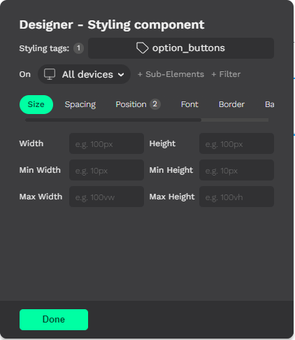
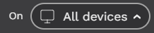
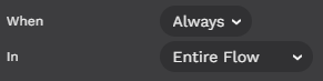
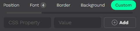
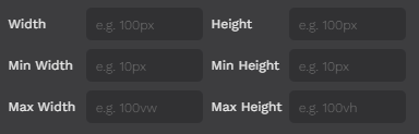
<table><thead><tr><th width="292">Image</th><th width="146.33333333333331">Name</th><th>Description</th></tr></thead><tbody><tr><td><img src="https://2080030610-files.gitbook.io/~/files/v0/b/gitbook-x-prod.appspot.com/o/spaces%2FgFafh00YOojEhbybq4uG%2Fuploads%2FNC2vUuKJphNOw3V0fUSa%2Fimage.png?alt=media&amp;token=121a8024-2291-4c0c-8ed6-15afbb5d1d2c" alt=""></td><td>Designer Card</td><td>This is the whole Designer card.</td></tr><tr><td><img src="https://2080030610-files.gitbook.io/~/files/v0/b/gitbook-x-prod.appspot.com/o/spaces%2FgFafh00YOojEhbybq4uG%2Fuploads%2FFKtV3niSgGgZJciI0ut9%2Fimage.png?alt=media&amp;token=1d089cee-df2e-4cd4-b63b-a5455a2a81f1" alt=""></td><td>Styling Tags</td><td>With our builder, we <strong>ALWAYS</strong> style tags (CSS classes). So if the component you've selected doesn't have one, please "<strong>Add a tag</strong>" now.</td></tr><tr><td><img src="https://2080030610-files.gitbook.io/~/files/v0/b/gitbook-x-prod.appspot.com/o/spaces%2FgFafh00YOojEhbybq4uG%2Fuploads%2Fpv0Tbrxn0LW4Vax248wK%2Fimage.png?alt=media&amp;token=1ea85ead-4c2c-4e22-ab97-5219873df4a3" alt="" data-size="original"></td><td>Refining Selector</td><td>You may want to set a <strong>more specific selector</strong>. You can specify it <strong>by device</strong> or even by different <strong>parts of a component</strong>. For example, you may want to style a button's image when viewed on a mobile device for a specific tag, but only on this page. By refining the selector, you'll be fine-tuning your styles.</td></tr><tr><td><img src="https://2080030610-files.gitbook.io/~/files/v0/b/gitbook-x-prod.appspot.com/o/spaces%2FgFafh00YOojEhbybq4uG%2Fuploads%2FUizjVgwgM9oi8k1s5tkx%2F2023-03-10_15h32_21.png?alt=media&amp;token=e8146bf7-c8e8-45b1-9875-d1c329b9d307" alt="" data-size="line"></td><td>Screen sizes</td><td>Here you can choose on which kind of device (<strong>screen size-related</strong>) the styles you set are going to be applied. The default option is "<strong>All devices</strong>", which sets styles for computer screens. You can also choose "<strong>Tablet</strong>" or "<strong>Mobile</strong>".</td></tr><tr><td><img src="https://2080030610-files.gitbook.io/~/files/v0/b/gitbook-x-prod.appspot.com/o/spaces%2FgFafh00YOojEhbybq4uG%2Fuploads%2FKrRQE6xWhWyDLD1316c6%2Fimage.png?alt=media&amp;token=361bd1fd-24d3-4baf-b697-538e68d6d790" alt=""></td><td>+ Sub-Element</td><td>This dropdown will display a list of the <strong>sub-elements</strong> that the <strong>selected component</strong> has. From here, you can choose which specific sub-element you want to style.</td></tr><tr><td><img src="https://2080030610-files.gitbook.io/~/files/v0/b/gitbook-x-prod.appspot.com/o/spaces%2FgFafh00YOojEhbybq4uG%2Fuploads%2FiomQ3DV0tbke54SVE4el%2Fimage.png?alt=media&amp;token=09041b03-5426-4f1c-abc0-94801bd05750" alt=""></td><td>+ Filter</td><td>In the "<strong>When</strong>" dropdown you'll find options like "<strong>hover</strong>", "<strong>disabled</strong>", "<strong>selected</strong>", etc. The options you'll see are going to depend on the kind of component you have selected.<br>Within the "<strong>In</strong>" dropdown, you'll be able to limit the <strong>reach of your tag</strong>. For example, you can select "<strong>This page</strong>" so that only the components with the tag you're styling and on this page would be affected by the styles you set.</td></tr><tr><td><img src="https://2080030610-files.gitbook.io/~/files/v0/b/gitbook-x-prod.appspot.com/o/spaces%2FgFafh00YOojEhbybq4uG%2Fuploads%2FdwFARYnMOGMa8DsP3H1r%2Fimage.png?alt=media&amp;token=2607241b-1cf9-4941-b9ce-d10d937c21ef" alt=""></td><td>Card Tabs</td><td>Tabs are <strong>groups of CSS properties</strong> that make it easier for you to find the property you want to set. Depending on the kind of component you have selected, you'll see a different set of tabs. Keep in mind that not all CSS properties can be applied to all kinds of elements.</td></tr><tr><td><img src="https://2080030610-files.gitbook.io/~/files/v0/b/gitbook-x-prod.appspot.com/o/spaces%2FgFafh00YOojEhbybq4uG%2Fuploads%2FA9AV7ZmmaHrrYfeFjuJm%2Fimage.png?alt=media&amp;token=f2211f9b-90d2-4647-bae2-5930d3231368" alt=""></td><td>Custom Properties</td><td>Not every <strong>CSS property</strong> is included on our tabs. If you want to use a <strong>not-so-common property</strong> and can't find it, you can always go to the last tab "<strong>Custom</strong>" and add any existing CSS property.</td></tr><tr><td><img src="https://2080030610-files.gitbook.io/~/files/v0/b/gitbook-x-prod.appspot.com/o/spaces%2FgFafh00YOojEhbybq4uG%2Fuploads%2FmbGSclyE28vnXJ7WcahE%2Fimage.png?alt=media&amp;token=003be877-f05e-453f-8533-609afcf2544c" alt=""></td><td>Style Input Section</td><td>This is the Inputs area, which changes depending on the tab you have selected. In this image you can see the properties from the "<strong>Size</strong>" tab.</td></tr></tbody></table>

## How-tos sections:

{% content-ref url="/pages/XBUR4nDT5vq5ximgyDYU" %}
[Design How-To's](/how-tos/design-how-tos)
{% endcontent-ref %}

{% content-ref url="/pages/3vz5029KElhSbAzNFdak" %}
[General How-To's](/how-tos/general-how-tos)
{% endcontent-ref %}

{% content-ref url="/pages/ijS1SFcgxwO3o0wJmZhs" %}
[Logic How-To's](/how-tos/logic-how-tos)
{% endcontent-ref %}


# Options Card

Quick guide to get started on how to set up the options for your flow components.

{% hint style="info" %}
Almost everything, not style related, you might want to give a custom setting would be found in this card. Watch the interactive video to learn more about it or if you prefer, read the detailed description below it.
{% endhint %}

{% @arcade/embed flowId="yWFShAZhG455SeHSCN4a" url="<https://app.arcade.software/share/yWFShAZhG455SeHSCN4a>" %}

<table><thead><tr><th width="292">Image</th><th width="134.33333333333331">Name</th><th>Description</th></tr></thead><tbody><tr><td><img src="https://2080030610-files.gitbook.io/~/files/v0/b/gitbook-x-prod.appspot.com/o/spaces%2FgFafh00YOojEhbybq4uG%2Fuploads%2FdTJNENegy53b5nwUGwK2%2F2023-04-06_13h33_47.png?alt=media&amp;token=d636fb5d-41ea-4b83-adae-85268569b637" alt=""></td><td>Options Card</td><td>This is the whole Options card.</td></tr><tr><td><img src="https://2080030610-files.gitbook.io/~/files/v0/b/gitbook-x-prod.appspot.com/o/spaces%2FgFafh00YOojEhbybq4uG%2Fuploads%2FyKzSapm4OGMCtpOxHfEq%2F2023-04-06_13h39_22.png?alt=media&amp;token=ae078082-38d9-4f82-85b4-84b1f52c1b87" alt=""></td><td>Duplicate Component</td><td>By clicking on the right top corner icon you can create a duplicate of the component you have selected. The new component would be placed by default right after the selected one.</td></tr><tr><td><img src="https://2080030610-files.gitbook.io/~/files/v0/b/gitbook-x-prod.appspot.com/o/spaces%2FgFafh00YOojEhbybq4uG%2Fuploads%2FV9dKYSnN2k2VgQ1r0izp%2F2023-04-06_13h43_38.png?alt=media&amp;token=7e607bb0-4a19-49a5-b985-cd7775a5cfe5" alt="" data-size="original"></td><td>Component Key</td><td>In this input, you'll be able to view and edit the selected component key (Keep in mind that a good practice is to never repeat keys).</td></tr><tr><td><img src="https://2080030610-files.gitbook.io/~/files/v0/b/gitbook-x-prod.appspot.com/o/spaces%2FgFafh00YOojEhbybq4uG%2Fuploads%2F3oTMiVRV5bQ7rGPOEIZ8%2F2023-04-06_13h45_25.png?alt=media&amp;token=08b563b8-9e48-4935-bdc6-09fb60a29df5" alt="" data-size="original"></td><td>Component Type</td><td>From this dropdown menu, you'll be able to change the selected component type.</td></tr><tr><td><img src="https://2080030610-files.gitbook.io/~/files/v0/b/gitbook-x-prod.appspot.com/o/spaces%2FgFafh00YOojEhbybq4uG%2Fuploads%2F1866iS3ghcyBCgm1hYTB%2F2023-04-06_13h49_36.png?alt=media&amp;token=500d1317-9bd5-48a4-a373-0f86b9545d08" alt=""></td><td>Card Tabs</td><td>These tabs group options in a couple categories to make it easier to find the option you are looking for.</td></tr><tr><td><img src="https://2080030610-files.gitbook.io/~/files/v0/b/gitbook-x-prod.appspot.com/o/spaces%2FgFafh00YOojEhbybq4uG%2Fuploads%2FP6wwzlOlBlOCoyQYkw1u%2F2023-04-06_13h52_50.png?alt=media&amp;token=1ffdfeaa-2ef3-4b3f-a0d8-b413ccd3aed7" alt=""></td><td>Position Tab</td><td>The "Position" tab, contains the options to move your components around. You can change the component parent container, or move the component up and down step by step.</td></tr><tr><td><img src="https://2080030610-files.gitbook.io/~/files/v0/b/gitbook-x-prod.appspot.com/o/spaces%2FgFafh00YOojEhbybq4uG%2Fuploads%2F0MY9Dr9iRkESu807nhUe%2F2023-04-06_13h55_56.png?alt=media&amp;token=44e6b951-115e-41df-8277-098cf45f4c1f" alt=""></td><td>Configuration Tab</td><td>The options shown here and in some other tabs would differ depending on the component type you have selected. Also the tabs you'll see would depend on the same.</td></tr><tr><td><img src="https://2080030610-files.gitbook.io/~/files/v0/b/gitbook-x-prod.appspot.com/o/spaces%2FgFafh00YOojEhbybq4uG%2Fuploads%2FC9dKkUOsTeB9br4Cpb2W%2F2023-04-06_13h56_54.png?alt=media&amp;token=0e55eeb3-cbfe-4c27-ac5f-96eee88351f3" alt=""></td><td>Content Tab</td><td>The options on this tab change a lot depending on the selected component type, they are all related to the component content. The ones you can see in the image on the left correspond to a button.</td></tr><tr><td><img src="https://2080030610-files.gitbook.io/~/files/v0/b/gitbook-x-prod.appspot.com/o/spaces%2FgFafh00YOojEhbybq4uG%2Fuploads%2Fsfscz66Lq120ab2B6axP%2F2023-04-06_14h01_28.png?alt=media&amp;token=e9453d24-2cc2-417a-aea7-b10745a69634" alt=""></td><td>Show/Hide Tab</td><td>In this tab, you can view, edit, create, or remove components show/hide conditions. The "Working with Logic" guide will dig deeper into this.</td></tr><tr><td><img src="https://2080030610-files.gitbook.io/~/files/v0/b/gitbook-x-prod.appspot.com/o/spaces%2FgFafh00YOojEhbybq4uG%2Fuploads%2FNodjPx3Ys2JrN1p1luZZ%2F2023-04-06_14h03_22.png?alt=media&amp;token=adb8818e-6387-4352-8459-a54cfeae0dce" alt=""></td><td>Buttons Tab</td><td>From here you can change things like the buttons' text, key, action when clicked, etc. If the component you've selected is an options selector you can access to edit these properties for each button or even add or remove buttons.</td></tr><tr><td><img src="https://2080030610-files.gitbook.io/~/files/v0/b/gitbook-x-prod.appspot.com/o/spaces%2FgFafh00YOojEhbybq4uG%2Fuploads%2F3yGKtBKk3BhZH4vMWmy5%2F2023-04-06_14h08_02.png?alt=media&amp;token=c840e5c3-29a6-42ea-ae80-fccf62a25472" alt=""></td><td>More Tab</td><td>And last, but not least. The "More" tab. Here you'll find some advanced or not-so-common options depending on the type of component as always. For most components here you'll only find the "Delete" button and "Element ID" input.<br>In the image here you are seeing the options for a whole page.</td></tr></tbody></table>

## How-tos sections:

{% content-ref url="/pages/XBUR4nDT5vq5ximgyDYU" %}
[Design How-To's](/how-tos/design-how-tos)
{% endcontent-ref %}

{% content-ref url="/pages/3vz5029KElhSbAzNFdak" %}
[General How-To's](/how-tos/general-how-tos)
{% endcontent-ref %}

{% content-ref url="/pages/ijS1SFcgxwO3o0wJmZhs" %}
[Logic How-To's](/how-tos/logic-how-tos)
{% endcontent-ref %}


# Working with Logic

Quick guide to get started on how to work with logic in the builder by writing custom JS code, using show/hide conditions, and a couple more tricks.

{% hint style="danger" %}
THIS DOCUMENT IS STILL A WORK IN PROGRESS
{% endhint %}

## Computed Fields & Actions:

{% @arcade/embed flowId="4k2q7SAkg8ie0ZKc9rR7" url="<https://app.arcade.software/share/4k2q7SAkg8ie0ZKc9rR7>" %}

## Show/Hide Conditions & Templating:

{% @arcade/embed flowId="kzwOK0ZmWewybeB18qnW" url="<https://app.arcade.software/share/kzwOK0ZmWewybeB18qnW>" %}

## How-tos sections:

{% content-ref url="/pages/XBUR4nDT5vq5ximgyDYU" %}
[Design How-To's](/how-tos/design-how-tos)
{% endcontent-ref %}

{% content-ref url="/pages/3vz5029KElhSbAzNFdak" %}
[General How-To's](/how-tos/general-how-tos)
{% endcontent-ref %}

{% content-ref url="/pages/ijS1SFcgxwO3o0wJmZhs" %}
[Logic How-To's](/how-tos/logic-how-tos)
{% endcontent-ref %}


# General How-To's


# How to select a container when I can’t click over it on the screen

Sometimes, you may need to select a container that is filled with components and lacks any padding, making it difficult to select without inadvertently selecting one of its child elements.

{% embed url="<https://firebasestorage.googleapis.com/v0/b/savvy-flow-uploads/o/oNrQLV6ZiVBavUmAkfcu%2FHow%20to%20select%20a%20container%20when%20I%20can%E2%80%99t%20click%20over%20it%20on%20the%20screen_9132727814344932.mp4?alt=media&token=23076326-0ec9-4afb-90b8-8a648db78015>" %}

1. Select any of the container children elements.
2. Select its parent container from the left-bottom element path display.

That’s it! Easy isn’t it 🙂

### Related Docs:

<table data-view="cards"><thead><tr><th align="center"></th><th data-hidden data-card-cover data-type="files"></th><th data-hidden data-card-target data-type="content-ref"></th></tr></thead><tbody><tr><td align="center">Selecting components that are behind the Embeddables card</td><td><a href="https://2080030610-files.gitbook.io/~/files/v0/b/gitbook-x-prod.appspot.com/o/spaces%2FgFafh00YOojEhbybq4uG%2Fuploads%2FWm2ekbhHJpovDEXamydf%2F2023-03-02_15h48_20.png?alt=media&amp;token=a8bb79a0-9f97-4a98-aff2-d696bc9b0b79">2023-03-02_15h48_20.png</a></td><td><a href="/how-tos/general-how-tos/how-to-select-components-that-are-behind-the-embeddables-card">How to select components that are behind the Embeddables card</a></td></tr><tr><td align="center"></td><td></td><td></td></tr><tr><td align="center"></td><td></td><td></td></tr></tbody></table>


# How to hide a global component on a specific page

This is meant to be done only for global components. Components that are not global shouldn’t exist on pages where they are not needed.

{% embed url="<https://firebasestorage.googleapis.com/v0/b/savvy-flow-uploads/o/oNrQLV6ZiVBavUmAkfcu%2FHow%20to%20hide%20a%20global%20component%20on%20one%20or%20more%20page__64054633636273.mp4?alt=media&token=836697dc-670f-46f5-babe-3933002484cb>" %}

#### Selecting the component you want to work on:

1. In the “**Edit**” sub-menu open the “**Designer**” card.
2. Click on the component you want to work on.

#### Option 1: Hide the component on one page:

1. Select the g**lobal component** you'd like to hide
2. &#x20;Click on “**+ Filter**” in the “**Designer**” card.
3. Change the "In" option to "This Page" so that any changes you make will only apply to the page you're currently viewing.
4. In the “**Position**” tab, set the “**Display**” property to “**none**”.

That’s it, the component would not be shown on the current page.

\_\_\_\_\_\_\_\_\_\_\_\_\_\_\_\_\_\_\_\_\_\_\_\_\_\_\_\_\_\_\_\_\_\_\_\_\_\_\_\_\_\_\_\_\_\_\_\_\_\_\_\_\_\_\_\_\_\_\_\_\_\_\_\_\_\_\_\_\_\_\_\_\_\_\_\_\_\_\_\_\_\_\_\_\_\_\_\_\_\_\_\_\_\_\_\_\_\_\_\_\_\_\_

#### Option 2: Hiding the component on several selected pages:

1. Add a descriptive tag to the page where you want the component to be hidden:
   1. Open the “**Designer**” card from the “**Edit**” sub-menu.
   2. Click the "**Or edit the whole page**" button without selecting any component.
   3. Click **"Add a tag".**
   4. Click **"+ Add a tag to this page".**
   5. Create a descriptive tag, like **"custom\_hide"** and click **“Add”.**
2. Without closing the “**Designer**” card, select the component you want to work on by clicking on it.
3. Set the component to be hidden on pages with the tag you’ve created:
   1. Click “**+ Filter**”.
   2. In the **"In"** options, select **"Pages with Tag".**
   3. In the **"Tag"** options, select the tag you've created on **STEP 1.**
   4. In the “**Position**” tab, set the “**Display**” property to “**none**”.
4. Finally, give the same tag to every page where you want the component to be hidden:
   1. On the **"Pages"** card, select the next page where you want the component to be hidden.
   2. Repeat **STEP 1** using the same tag you’ve created in **STEP 1.e**.

That’s it, you've hidden the component on every page that has the right tag! (E.g. custom\_hide)

### Related docs:

<table data-view="cards"><thead><tr><th></th><th></th><th></th></tr></thead><tbody><tr><td></td><td></td><td></td></tr><tr><td></td><td></td><td></td></tr><tr><td></td><td></td><td></td></tr></tbody></table>


# How to calculate statistical significance from split test

Quick guide on how to calculate the statistical significance of a split test.

{% embed url="<https://firebasestorage.googleapis.com/v0/b/guidde-production.appspot.com/o/uploads%2FccTLhjEOctdqtSfZMup1o5en3Bl1%2F3ubJ4DLcwuL1AuJMUwg1W7.mp4?alt=media&token=c72b2f55-3fea-4668-90b2-45e607486838>" %}

1. In the “**Split Testing**” sub-menu open the “**View current tests**” card.
2. Click the “**Analytics**” button for the specific split test you want to analyze.
3. Select a **conversion page** or create it if the experiment doesn’t yet have one. Then “**Save and continue**”.

{% hint style="warning" %}
Results may take up to 2 minutes to be calculated and shown.
{% endhint %}

4. You can now select a specific **time period**, and check out the total **visitors**, **conversions**, and **conversions percentage** for that specific period using the two available dropdowns.
5. Click the “**Calculate stat sig**” button.

{% hint style="info" %}
At this point you'll see your experiment data displayed on the Statistical significance calculator card.
{% endhint %}

{% hint style="danger" %}
The following steps are in revision stage, they might not be accurate.&#x20;
{% endhint %}

6. Choose a level of confidence.
7. Click the “Calculate” button.
8. You can now see how your split test has performed over your selected period of time.

### Related Docs:

<table data-view="cards"><thead><tr><th></th><th></th><th></th></tr></thead><tbody><tr><td></td><td></td><td></td></tr><tr><td></td><td></td><td></td></tr><tr><td></td><td></td><td></td></tr></tbody></table>


# How to install a Google font.

Sometimes you want to use a font that is not the default one. You can easily install any Google Font by following the steps in this tutorial.

{% embed url="<https://app.arcade.software/share/oaVBa05sosjopzQLJ5VS>" %}

1. In the "**Designer**" card, with any component selected, go to the "**Font**" tab.
2. At the bottom, in the "**Installed fonts**" input, click "**+ Add font**".
3. Select all the font **weights** you want to use and **regular/Italic** variation.
4. Then **type the font name** and click "**Install**".
5. Finally, click the sidebar "**Save**" button for the new font to finish applying to your flow.<br>

{% hint style="success" %}
You can also install custom fonts using the font script.
{% endhint %}

### Related docs:

<table data-view="cards"><thead><tr><th align="center"></th><th data-hidden data-card-target data-type="content-ref"></th></tr></thead><tbody><tr><td align="center"><strong>How to add a custom font from a website</strong></td><td><a href="/other-useful-docs/work-in-progress/pending/work-in-progress-how-to-add-a-custom-font-from-a-website">Work in Progress: How to add a custom font from a website:</a></td></tr><tr><td align="center"></td><td></td></tr><tr><td align="center"></td><td></td></tr></tbody></table>


# How to use "Logs" for debugging

Sometimes you need to do some debugging to understand why something unexpected is happening (debugging). Here you'll learn how to do this using event logs.

{% embed url="<https://app.arcade.software/share/GIe6wHr6NRud49qZON1f>" %}

### Where to find event logs:

You can see the event logs by opening the "**Logs**" card in the "**Debug**" sub-menu.

Here you can **filter by log type** just selecting the "Pages", "User Input", "Computed", or "Actions"  tabs.&#x20;

### Refreshing logs and "Live mode":

{% hint style="info" %}
If you have the "Logs" card open and you are interacting with the page, new logs are being generated but you are not going to see them unless you refresh the "Logs" card or activate the live mode.
{% endhint %}

* **Refreshing**: To refresh the logs card just click the refresh icon at the **top right corner** of the card.
* **Live mode**: To activate the live mode just click the **lightning icon**. When active you'll see it green and new events are going to be shown automatically.

### Deleting logs:

{% hint style="info" %}
Sometimes you'll want a fresh start with no logs just to have a more clear view of what happens when you do X action in your flow.&#x20;
{% endhint %}

To delete all logs just click on the "**Clear logs**" icon in the top right corner by the "Refresh" icon. You'll then need to confirm deleting by clicking "Yes" in a popup warning.

### Recording computed field logs:

{% hint style="info" %}
By default computed field logs are not recorded.
{% endhint %}

To activate the computed field logs recording you need to:

1. Go to the "Computed" tab.
2. Click on the "Start recording CFs" icon at the top right corner, right by the "Live mode" lightning icon.

Once activated the recording would continue until you stop it by clicking the same button again. While recording is active the icon would be red.

### Event snapshot:

{% hint style="info" %}
The event snapshot is a snapshot of all user data at the moment right after the event happened.
{% endhint %}

To open the snapshot of a specific event you just need to click the "**View User Data Snapshot**" placed inside the event summary card. \
By clicking on any value inside the snapshot you'll automatically get a copy of that variable value to your clipboard.

{% hint style="warning" %}
Computed field logs have 2 snapshots, one to see the user data after the CF execution and another to see how the user data state was right before
{% endhint %}

### Related docs:

<table data-view="cards"><thead><tr><th align="center"></th><th data-hidden data-card-target data-type="content-ref"></th><th data-hidden data-card-cover data-type="files"></th></tr></thead><tbody><tr><td align="center"><mark style="color:blue;"><strong>Conditions</strong></mark></td><td><a href="/other-useful-docs/useful-docs/conditions">Conditions</a></td><td><a href="https://2080030610-files.gitbook.io/~/files/v0/b/gitbook-x-prod.appspot.com/o/spaces%2FgFafh00YOojEhbybq4uG%2Fuploads%2FD9dsNmS3qe0m1WH9Lk1Q%2F2023-03-07_11h42_21.png?alt=media&amp;token=1a72ff04-dfb9-4449-aa97-497bd8cd4c5d">2023-03-07_11h42_21.png</a></td></tr><tr><td align="center"></td><td></td><td></td></tr><tr><td align="center"></td><td></td><td></td></tr></tbody></table>


# How to change pages order

Sometimes you need to change your flow page order, maybe because you’ve cloned a page and the new one should be in another position, or maybe just because you want to change the flow path.

{% embed url="<https://firebasestorage.googleapis.com/v0/b/savvy-flow-uploads/o/oNrQLV6ZiVBavUmAkfcu%2FChanging%20pages%20order__9572155296101397.mp4?alt=media&token=40778874-25fc-407a-8eae-d4c915d9e78b>" %}

1. On the “**Pages**” card, scroll to find the page you want to move.
2. Move it up or down by clicking on the “**Up**” or “**Down**” arrow icons.

That’s it! Enjoy re-arranging your flow 🙂

### Related Docs:

<table data-view="cards"><thead><tr><th align="center"></th><th data-hidden data-card-target data-type="content-ref"></th><th data-hidden data-card-cover data-type="files"></th></tr></thead><tbody><tr><td align="center"><mark style="color:blue;"><strong>Changing a Component's Location</strong></mark></td><td><a href="/how-tos/design-how-tos/how-to-change-a-components-location">How to change a component's location</a></td><td><a href="https://2080030610-files.gitbook.io/~/files/v0/b/gitbook-x-prod.appspot.com/o/spaces%2FgFafh00YOojEhbybq4uG%2Fuploads%2FX8EmqeWmcQ3sYBrDZepR%2F2023-03-02_11h31_40.png?alt=media&amp;token=d5e71fcf-9d85-40f7-90b7-b5cdb190eabe">2023-03-02_11h31_40.png</a></td></tr><tr><td align="center"><mark style="color:blue;"><strong>Cloning a Page</strong></mark></td><td><a href="/how-tos/general-how-tos/how-to-clone-a-page">How to clone a page</a></td><td><a href="https://2080030610-files.gitbook.io/~/files/v0/b/gitbook-x-prod.appspot.com/o/spaces%2FgFafh00YOojEhbybq4uG%2Fuploads%2FrftKOwEXbv7kuJHBWEf6%2F2023-03-02_11h34_03.png?alt=media&amp;token=0aac4096-49fa-4e73-b3d0-50e0a6478bc7">2023-03-02_11h34_03.png</a></td></tr><tr><td align="center"><mark style="color:blue;"><strong>Adding new components to a page</strong></mark></td><td><a href="/how-tos/general-how-tos/how-to-add-new-components-to-a-page">How to add new components to a page</a></td><td><a href="https://2080030610-files.gitbook.io/~/files/v0/b/gitbook-x-prod.appspot.com/o/spaces%2FgFafh00YOojEhbybq4uG%2Fuploads%2F1JRnLSAxeNKgRdvwGTec%2F2023-03-07_11h50_47.png?alt=media&amp;token=8eec199b-e48b-46ef-86a6-c6d81c6da961">2023-03-07_11h50_47.png</a></td></tr></tbody></table>


# How to select components that are behind the Embeddables card

Sometimes you have an embeddables card already open and you want to select a component that is behind it. Here is how to do it.

{% embed url="<https://firebasestorage.googleapis.com/v0/b/savvy-flow-uploads/o/oNrQLV6ZiVBavUmAkfcu%2FSelecting%20components%20that%20are%20behind%20the%20Embeddables%20card%20(1)_27108216911409033.mp4?alt=media&token=4f6a221a-066d-4582-bf6b-21f9dcb84f5c>" %}

1. Click on the brush icon to close the “**Designer**” card.
2. Select the component.
3. Open the “**Designer”** card again. You’ll then be editing the previously selected component styles.

### Related docs:

<table data-view="cards"><thead><tr><th align="center"></th><th data-hidden data-card-target data-type="content-ref"></th><th data-hidden data-card-cover data-type="files"></th></tr></thead><tbody><tr><td align="center"><mark style="color:blue;"><strong>Selecting the whole page</strong></mark></td><td><a href="/how-tos/general-how-tos/how-to-select-the-whole-page">How to select the whole page</a></td><td><a href="https://2080030610-files.gitbook.io/~/files/v0/b/gitbook-x-prod.appspot.com/o/spaces%2FgFafh00YOojEhbybq4uG%2Fuploads%2F089AOuRQi3nUPaHBPt36%2F2023-03-07_12h01_29.png?alt=media&amp;token=ad3a978f-5311-4883-b6f7-785686e706a2">2023-03-07_12h01_29.png</a></td></tr><tr><td align="center"><mark style="color:blue;"><strong>How to select a container when I can’t click over it on the screen</strong></mark></td><td><a href="/how-tos/general-how-tos/how-to-select-a-container-when-i-cant-click-over-it-on-the-screen">How to select a container when I can’t click over it on the screen</a></td><td><a href="https://2080030610-files.gitbook.io/~/files/v0/b/gitbook-x-prod.appspot.com/o/spaces%2FgFafh00YOojEhbybq4uG%2Fuploads%2FsgiTSHygnzUMBPVIj3Rp%2F2023-03-07_12h09_33.png?alt=media&amp;token=f1bdda09-a009-4e6e-ba0e-72a5c9b0be06">2023-03-07_12h09_33.png</a></td></tr><tr><td align="center"><mark style="color:blue;"><strong>Adding new components to a page</strong></mark></td><td><a href="/how-tos/general-how-tos/how-to-add-new-components-to-a-page">How to add new components to a page</a></td><td><a href="https://2080030610-files.gitbook.io/~/files/v0/b/gitbook-x-prod.appspot.com/o/spaces%2FgFafh00YOojEhbybq4uG%2Fuploads%2F1JRnLSAxeNKgRdvwGTec%2F2023-03-07_11h50_47.png?alt=media&amp;token=8eec199b-e48b-46ef-86a6-c6d81c6da961">2023-03-07_11h50_47.png</a></td></tr></tbody></table>


# How to clone a page

Sometimes you want to clone a page that is similar to the one you need to build next so you have a starting point that already includes components and styles that you've already worked on.

{% embed url="<https://app.arcade.software/share/sSwwU69wQQGKsV9SHeo3>" %}

1. In the "**Pages**" card <img src="https://2080030610-files.gitbook.io/~/files/v0/b/gitbook-x-prod.appspot.com/o/spaces%2FgFafh00YOojEhbybq4uG%2Fuploads%2FYG1xKxVD0I5dtGjCxOda%2FGroup%20163.jpg?alt=media&amp;token=9b7cbb40-19c3-477d-bdb1-3e038093da85" alt="" data-size="line">search for the page you want to clone.
2. Click on the "**Duplicate**" icon <img src="https://2080030610-files.gitbook.io/~/files/v0/b/gitbook-x-prod.appspot.com/o/spaces%2FgFafh00YOojEhbybq4uG%2Fuploads%2FlQEJBMhcdcwn4LGKGyCA%2FGroup%20193.jpg?alt=media&amp;token=40141097-f4a1-4b47-b293-71b2e83f968c" alt="" data-size="line"> over the page preview.
3. Give a different name to the new page and click "**Duplicate**".

{% hint style="info" %}
IMPORTANT! The new page and its content would have the same tags the original one had. So, when styling, remember that if you use the same tag you’ll be changing the styles for both pages or components.
{% endhint %}

### Related docs:

<table data-view="cards"><thead><tr><th align="center"></th><th data-hidden data-card-target data-type="content-ref"></th><th data-hidden data-card-cover data-type="files"></th></tr></thead><tbody><tr><td align="center"><mark style="color:blue;"><strong>Changing pages order</strong></mark></td><td><a href="/how-tos/general-how-tos/how-to-change-pages-order">How to change pages order</a></td><td><a href="https://2080030610-files.gitbook.io/~/files/v0/b/gitbook-x-prod.appspot.com/o/spaces%2FgFafh00YOojEhbybq4uG%2Fuploads%2F9gVZfhiFoHrsggFPDath%2F2023-03-07_11h19_37.png?alt=media&amp;token=b3b71036-c97a-43f8-ad96-63ecf09cf9ff">2023-03-07_11h19_37.png</a></td></tr><tr><td align="center"><mark style="color:blue;"><strong>Selecting the whole page</strong></mark></td><td><a href="/how-tos/general-how-tos/how-to-select-the-whole-page">How to select the whole page</a></td><td><a href="https://2080030610-files.gitbook.io/~/files/v0/b/gitbook-x-prod.appspot.com/o/spaces%2FgFafh00YOojEhbybq4uG%2Fuploads%2FWc0Fk1W6i18FBX1rsgsC%2F2023-03-07_11h17_21.png?alt=media&amp;token=5f6b86ef-9157-4f77-b967-83e8da93e496">2023-03-07_11h17_21.png</a></td></tr><tr><td align="center"><mark style="color:blue;"><strong>Adding new components to a page</strong></mark></td><td><a href="/how-tos/general-how-tos/how-to-add-new-components-to-a-page">How to add new components to a page</a></td><td><a href="https://2080030610-files.gitbook.io/~/files/v0/b/gitbook-x-prod.appspot.com/o/spaces%2FgFafh00YOojEhbybq4uG%2Fuploads%2F1JRnLSAxeNKgRdvwGTec%2F2023-03-07_11h50_47.png?alt=media&amp;token=8eec199b-e48b-46ef-86a6-c6d81c6da961">2023-03-07_11h50_47.png</a></td></tr></tbody></table>


# How to add new components to a page

As a normal part of creating your flow, you'd need to add new components to your pages. Here is how to do it with our tool.

{% embed url="<https://app.arcade.software/share/iFxmN0111Pb9KLDdw3Qb>" %}

{% hint style="info" %}
Before adding your new component you can decide where you want it to be added. For this purpose you need to know that the new component would always be inserted right after the component you have selected at the moment or in the case the component you have selected is a container, the new component would be added as the last element inside it.
{% endhint %}

1. Select the position you want the new component to be added in. (As explained in the above info box).
2. Open the "Add" card and select the type of component you want to add.

### Related docs:

<table data-view="cards"><thead><tr><th align="center"></th><th data-hidden data-card-cover data-type="files"></th><th data-hidden data-card-target data-type="content-ref"></th></tr></thead><tbody><tr><td align="center"><mark style="color:blue;"><strong>Cloning a page</strong></mark></td><td><a href="https://2080030610-files.gitbook.io/~/files/v0/b/gitbook-x-prod.appspot.com/o/spaces%2FgFafh00YOojEhbybq4uG%2Fuploads%2F9pmdT9OF9qgAlQUANf0S%2F2023-03-07_11h18_39.png?alt=media&amp;token=83913c5f-c8bf-484e-94f3-dccf5de989cf">2023-03-07_11h18_39.png</a></td><td><a href="/how-tos/general-how-tos/how-to-clone-a-page">How to clone a page</a></td></tr><tr><td align="center"><mark style="color:blue;"><strong>Changing a component's location</strong></mark></td><td><a href="https://2080030610-files.gitbook.io/~/files/v0/b/gitbook-x-prod.appspot.com/o/spaces%2FgFafh00YOojEhbybq4uG%2Fuploads%2Fsjvd87rbEL9a1iWRVpGM%2F2023-03-07_11h45_23.png?alt=media&amp;token=2247c103-767f-4310-a3cf-7f5080baa51c">2023-03-07_11h45_23.png</a></td><td><a href="/how-tos/design-how-tos/how-to-change-a-components-location">How to change a component's location</a></td></tr><tr><td align="center"><mark style="color:blue;"><strong>Uploading and applying images to your design</strong></mark></td><td><a href="https://2080030610-files.gitbook.io/~/files/v0/b/gitbook-x-prod.appspot.com/o/spaces%2FgFafh00YOojEhbybq4uG%2Fuploads%2FaLbKzzBXldXngTzyNTsG%2F2023-03-07_11h47_24.png?alt=media&amp;token=054aabc4-97d6-43c2-ae7d-01ccacd40ae8">2023-03-07_11h47_24.png</a></td><td><a href="/how-tos/design-how-tos/how-to-upload-and-apply-images-to-your-design">How to upload and apply images to your design</a></td></tr></tbody></table>


# How to select the whole page

Sometimes you need to style the whole page and not just a “main container”. Here is how to select the whole page to do so.

{% embed url="<https://firebasestorage.googleapis.com/v0/b/savvy-flow-uploads/o/oNrQLV6ZiVBavUmAkfcu%2FSelecting%20the%20whole%20page_4513221587315104.mp4?alt=media&token=39930a01-bfa6-402b-aeb3-a24c45825c36>" %}

1. Open the “Designer” card.
2. Click on “Or edit the whole page.”.

Done, you can now style the page!

{% hint style="info" %}
If the page doesn’t already have a tag you’ll need to give it a tag in order to be able to style it. Remember, in the builder we always style tags.
{% endhint %}

### Related Docs:

<table data-view="cards"><thead><tr><th align="center"></th><th data-hidden data-card-cover data-type="files"></th><th data-hidden data-card-target data-type="content-ref"></th></tr></thead><tbody><tr><td align="center"><mark style="color:blue;"><strong>Styling components: Basics</strong></mark></td><td><a href="https://2080030610-files.gitbook.io/~/files/v0/b/gitbook-x-prod.appspot.com/o/spaces%2FgFafh00YOojEhbybq4uG%2Fuploads%2FRT1uS1DzhfxK2ctVqEnk%2F2023-03-07_11h26_17.png?alt=media&amp;token=981f4798-9d22-461d-ba63-ce1a3f75f0f6">2023-03-07_11h26_17.png</a></td><td><a href="/how-tos/design-how-tos/how-to-style-components-basics">How to style components (basics)</a></td></tr><tr><td align="center"><mark style="color:blue;"><strong>Cloning a page</strong></mark></td><td><a href="https://2080030610-files.gitbook.io/~/files/v0/b/gitbook-x-prod.appspot.com/o/spaces%2FgFafh00YOojEhbybq4uG%2Fuploads%2F9pmdT9OF9qgAlQUANf0S%2F2023-03-07_11h18_39.png?alt=media&amp;token=83913c5f-c8bf-484e-94f3-dccf5de989cf">2023-03-07_11h18_39.png</a></td><td><a href="/how-tos/general-how-tos/how-to-clone-a-page">How to clone a page</a></td></tr><tr><td align="center"><mark style="color:blue;"><strong>Changing pages order</strong></mark></td><td><a href="https://2080030610-files.gitbook.io/~/files/v0/b/gitbook-x-prod.appspot.com/o/spaces%2FgFafh00YOojEhbybq4uG%2Fuploads%2FnOvxMshWINicP1mD8FqP%2F2023-03-07_11h37_57.png?alt=media&amp;token=37fce94a-083c-4d8c-849d-996966aceec0">2023-03-07_11h37_57.png</a></td><td><a href="/how-tos/general-how-tos/how-to-change-pages-order">How to change pages order</a></td></tr></tbody></table>


# How to view your flow on different screen sizes

Usually, you would like to have a responsive flow and the ability to check how it's going to look on different devices. Viewing like different devices has never been so simple.

{% embed url="<https://firebasestorage.googleapis.com/v0/b/savvy-flow-uploads/o/oNrQLV6ZiVBavUmAkfcu%2FHow%20to%20view%20different%20screen%20sizes_5109459621266863.mp4?alt=media&token=1d01f81a-ccbb-4c99-b546-2e0f62cd696d>" %}

**In Savvy, it’s easy to view how your flow will look on different screen sizes.**

Just click on the **Breakpoints** button (the last one at the bottom of the sidebar), by clicking on it you would be switching from desktop to tablet to mobile and back to desktop.

### Related Docs:

<table data-view="cards"><thead><tr><th align="center"></th><th data-hidden data-card-target data-type="content-ref"></th><th data-hidden data-card-cover data-type="files"></th></tr></thead><tbody><tr><td align="center"><mark style="color:blue;"><strong>Making my flow responsive</strong></mark></td><td><a href="/how-tos/design-how-tos/how-to-make-my-flow-responsive">How to make my flow responsive</a></td><td><a href="https://2080030610-files.gitbook.io/~/files/v0/b/gitbook-x-prod.appspot.com/o/spaces%2FgFafh00YOojEhbybq4uG%2Fuploads%2FMWLVJ7RDNVcUX9pW4Yuq%2F2023-03-07_11h21_28.png?alt=media&amp;token=ceb713a0-6ad7-42a3-baab-448276e37e61">2023-03-07_11h21_28.png</a></td></tr><tr><td align="center"></td><td></td><td></td></tr><tr><td align="center"></td><td></td><td></td></tr></tbody></table>


# How to move between pages while editing your flow

For sure you'll need to move from one page to another to edit all of them. Here is how to do it with our builder.

{% embed url="<https://firebasestorage.googleapis.com/v0/b/savvy-flow-uploads/o/oNrQLV6ZiVBavUmAkfcu%2FHow%20to%20change%20in%20between%20pages_2351322679485226.mp4?alt=media&token=054b4230-9417-4f56-9ddc-d028a8453e92>" %}

1. Open the "**Pages**" card.
2. **Select** from the list the page you want to go to by just clicking on it.

That's it, you can now edit this page.

### Related docs:

<table data-view="cards"><thead><tr><th align="center"></th><th data-hidden data-card-target data-type="content-ref"></th><th data-hidden data-card-cover data-type="files"></th></tr></thead><tbody><tr><td align="center"><mark style="color:blue;"><strong>Changing pages order</strong></mark></td><td><a href="/how-tos/general-how-tos/how-to-change-pages-order">How to change pages order</a></td><td><a href="https://2080030610-files.gitbook.io/~/files/v0/b/gitbook-x-prod.appspot.com/o/spaces%2FgFafh00YOojEhbybq4uG%2Fuploads%2F9gVZfhiFoHrsggFPDath%2F2023-03-07_11h19_37.png?alt=media&amp;token=b3b71036-c97a-43f8-ad96-63ecf09cf9ff">2023-03-07_11h19_37.png</a></td></tr><tr><td align="center"><mark style="color:blue;"><strong>Cloning a page</strong></mark></td><td><a href="/how-tos/general-how-tos/how-to-clone-a-page">How to clone a page</a></td><td><a href="https://2080030610-files.gitbook.io/~/files/v0/b/gitbook-x-prod.appspot.com/o/spaces%2FgFafh00YOojEhbybq4uG%2Fuploads%2F9pmdT9OF9qgAlQUANf0S%2F2023-03-07_11h18_39.png?alt=media&amp;token=83913c5f-c8bf-484e-94f3-dccf5de989cf">2023-03-07_11h18_39.png</a></td></tr><tr><td align="center"><mark style="color:blue;"><strong>Selecting the whole page</strong></mark></td><td><a href="/how-tos/general-how-tos/how-to-select-the-whole-page">How to select the whole page</a></td><td><a href="https://2080030610-files.gitbook.io/~/files/v0/b/gitbook-x-prod.appspot.com/o/spaces%2FgFafh00YOojEhbybq4uG%2Fuploads%2FWc0Fk1W6i18FBX1rsgsC%2F2023-03-07_11h17_21.png?alt=media&amp;token=5f6b86ef-9157-4f77-b967-83e8da93e496">2023-03-07_11h17_21.png</a></td></tr></tbody></table>


# Design How-To's


# How to style a specific component element (E.g. buttons image)

Some components have various sub-elements that you can style separately. E.g. options selectors have buttons, list, images, etc. Here you'll learn how style a specific sub-element.

{% embed url="<https://app.arcade.software/share/Hvh8XxhrHb2787ycUXFg>" %}

### Styling a sub-element:

1. In the "**Edit**" sub-menu, open the "**Designer**" card and then select a component from your page.
2. Click on "**+ Sub-Elements**" to get the selected component's sub-elements list.
3. From the "**Elements**" dropdown menu select the specific part of the component you want to add styles to. E.g. buttons checkbox.
4. Add your styles.

### Applying styles to a specific button in an Options Selector:

1. In the "**Edit**" sub-menu, open the "**Designer**" card and then select a component from your page.
2. Click on "**+ Sub-Elements**" to get the selected component's sub-elements list.
3. Click on "**+ By Button**" and select the button key of the one you want to style.
4. Add your styles.

### &#x20;Applying styles on a specific component state (hover, selected, etc):

1. In the "**Edit**" sub-menu, open the "**Designer**" card and then select a component from your page.
2. Click on "**+ Filter**".
3. From the "**When**" dropdown menu, **select the state** you want to apply styles to. These options are going to be different depending on the kind of component you have selected.
4. Add your styles.

### Limiting the tag's reach:

{% hint style="info" %}
**Tags** in out builder work like **CSS classes**. As you know, if you add styles to a tag, every component that has that tag would then get that styling. Here you'll learn how to limit a tag's reach.
{% endhint %}

1. In the "**Edit**" sub-menu, open the "**Designer**" card and then select a component from your page.
2. Click on "**+ Filter**".
3. From the "**In**" dropdown menu, you can choose to limit to components with this tag but only on **this page**, or components with this tag but only on **pages with a specific tag**.
4. Add your styling.

### Related docs:

<table data-view="cards"><thead><tr><th align="center"></th><th data-hidden data-card-target data-type="content-ref"></th><th data-hidden data-card-cover data-type="files"></th></tr></thead><tbody><tr><td align="center"><mark style="color:blue;"><strong>How to style individual buttons (by button key) in Options Selectors</strong></mark></td><td><a href="/how-tos/design-how-tos/how-to-style-individual-buttons-by-button-key-in-options-selectors">How to style individual buttons (by button key) in Options Selectors</a></td><td><a href="https://2080030610-files.gitbook.io/~/files/v0/b/gitbook-x-prod.appspot.com/o/spaces%2FgFafh00YOojEhbybq4uG%2Fuploads%2Fip5BXyZuu8OCHO6joPFs%2F2023-03-07_10h01_54.png?alt=media&amp;token=2b858a72-7485-4da6-825c-f3002cf57c7f">2023-03-07_10h01_54.png</a></td></tr><tr><td align="center"><mark style="color:blue;"><strong>Selecting the whole page</strong></mark></td><td><a href="/how-tos/general-how-tos/how-to-select-the-whole-page">How to select the whole page</a></td><td><a href="https://2080030610-files.gitbook.io/~/files/v0/b/gitbook-x-prod.appspot.com/o/spaces%2FgFafh00YOojEhbybq4uG%2Fuploads%2F089AOuRQi3nUPaHBPt36%2F2023-03-07_12h01_29.png?alt=media&amp;token=ad3a978f-5311-4883-b6f7-785686e706a2">2023-03-07_12h01_29.png</a></td></tr><tr><td align="center"><mark style="color:blue;"><strong>Styling CSS properties that are not there in the designer card (custom properties)</strong></mark></td><td><a href="/how-tos/design-how-tos/how-to-style-css-properties-that-are-not-there-in-the-designer-card-custom-properties">How to style CSS properties that are not there in the designer card (custom properties)</a></td><td><a href="https://2080030610-files.gitbook.io/~/files/v0/b/gitbook-x-prod.appspot.com/o/spaces%2FgFafh00YOojEhbybq4uG%2Fuploads%2Fxns1t1b9iwf5LJDeILKK%2F2023-03-07_11h57_53.png?alt=media&amp;token=581963b5-2e2a-413c-9717-77db7b149484">2023-03-07_11h57_53.png</a></td></tr></tbody></table>


# How to style individual buttons (by button key) in Options Selectors

Customizing styles for buttons in a common options selector may be necessary, such as to achieve varied text and box shadow color as seen in the image below.

<figure><img src="https://2080030610-files.gitbook.io/~/files/v0/b/gitbook-x-prod.appspot.com/o/spaces%2FgFafh00YOojEhbybq4uG%2Fuploads%2FgZOC74W6FlWoapZKOey9%2F2023-02-17_10h42_52.png?alt=media&amp;token=bcab3ed0-ed0a-4b55-9e59-6b42bfcc5f32" alt=""><figcaption></figcaption></figure>

{% embed url="<https://firebasestorage.googleapis.com/v0/b/savvy-flow-uploads/o/oNrQLV6ZiVBavUmAkfcu%2FHow%20to%20style%20individual%20buttons%20(by%20button%20key)%20in%20Options%20Selectors_6640024316047117.mp4?alt=media&token=f22bf50a-533d-44a2-abb8-618125b2fd51>" %}

#### Selecting the component to style:

1. In the “**Edit**” sub-menu open the “**Designer**” card.
2. Select the "**Options buttons**" component you want to style on your page.

#### Setting the Designer card to style a specific button:

1. Click “**+ Sub-Element**”.
2. In the “**Elements**” selector, select “**Button**”.
3. Click “**+ By Button**”.
4. In the “**By Key**” selector choose the key that belongs to the button you want to style.

That’s it, you now know how to give a different style to each button! **👍**

### Related Docs:

<table data-view="cards"><thead><tr><th align="center"></th><th data-hidden data-card-cover data-type="files"></th><th data-hidden data-card-target data-type="content-ref"></th></tr></thead><tbody><tr><td align="center"><mark style="color:blue;"><strong>How to style a rounded bullet-like checkbox for options buttons</strong></mark></td><td><a href="https://2080030610-files.gitbook.io/~/files/v0/b/gitbook-x-prod.appspot.com/o/spaces%2FgFafh00YOojEhbybq4uG%2Fuploads%2FVDJdnvcpkt14wxRike7h%2F2023-03-02_17h01_08.png?alt=media&amp;token=018c2ceb-275b-4a50-b95e-8bc7104b0d90">2023-03-02_17h01_08.png</a></td><td><a href="/how-tos/design-how-tos/how-to-style-a-rounded-bullet-like-checkbox-for-options-buttons">How to style a rounded bullet-like checkbox for options buttons</a></td></tr><tr><td align="center"><mark style="color:blue;"><strong>How to style a specific component element (E.g. buttons image)</strong></mark></td><td><a href="https://2080030610-files.gitbook.io/~/files/v0/b/gitbook-x-prod.appspot.com/o/spaces%2FgFafh00YOojEhbybq4uG%2Fuploads%2Fs9os5CNDCsb4gkSmu3ax%2F2023-03-07_10h04_09.png?alt=media&amp;token=d6990cbc-095c-493d-b350-d11f2f142e55">2023-03-07_10h04_09.png</a></td><td><a href="/how-tos/design-how-tos/how-to-style-a-specific-component-element-e.g.-buttons-image">How to style a specific component element (E.g. buttons image)</a></td></tr><tr><td align="center"></td><td></td><td></td></tr></tbody></table>


# How to style a rounded bullet-like checkbox for options buttons

This tutorial takes you step by step on how to create rounded checkboxes for options buttons with styling similar to the one shown in the following image:

<figure><img src="https://2080030610-files.gitbook.io/~/files/v0/b/gitbook-x-prod.appspot.com/o/spaces%2FgFafh00YOojEhbybq4uG%2Fuploads%2FUYRdAFPxfGscyxbuGP6p%2FUntitled.png?alt=media&amp;token=9efc501e-6a9f-4efe-93ec-2cb44a9ee09e" alt=""><figcaption></figcaption></figure>

{% embed url="<https://firebasestorage.googleapis.com/v0/b/savvy-flow-uploads/o/oNrQLV6ZiVBavUmAkfcu%2FHow%20to%20style%20a%20rounded%20bullet-like%20checkbox_20949415811219896.mp4?alt=media&token=3835f655-9463-456b-b4f6-ea1dbc342829>" %}

#### Select the checkbox element for styling:

1. In the “**Edit”** sub-menu open the “**Designer”** card.
2. Select the Options buttons component you want to style.
3. Click "**+ Sub-Elements**".
4. Change the “**Element**” you want to style from “**whole thing**” to “**Checkbox**”.

#### Add styles to the checkbox:

1. In the “**Border**” tab:

   a.   Give a value to the border property e.g. <mark style="color:red;">`1px solid black`</mark>

   b.   Set a border radius e.g. <mark style="color:red;">`25px`</mark>
2. In the “**Size**” tab, give the checkbox a matching width and height e.g. <mark style="color:red;">`25px`</mark>

#### Create and style the inner circle:

1. In the “**Font**” tab (the tick is styled as a font), set the <mark style="color:red;">`font-size`</mark> to <mark style="color:red;">`0px`</mark> or <mark style="color:red;">`color:`</mark>` ``transparent` to make it not visible.
2. Click “**+ Filter**” to be able to filter by selected state styling. Change the "When" option to “Selected” to style the checkbox selected state.
3. In the “**Background**” tab, give the checkbox a background color.
4. In the “**Border**” tab, set an inner box shadow to separate the background color from the checkbox border e.g. <mark style="color:red;">`inset 0px 0px 0px 3.5px #fff`</mark>

That’s it! You can now play with styling to get it exactly as you want it to be!.

### Related Docs:

<table data-view="cards"><thead><tr><th align="center"></th><th data-hidden data-card-target data-type="content-ref"></th><th data-hidden data-card-cover data-type="files"></th></tr></thead><tbody><tr><td align="center"><mark style="color:blue;"><strong>Styling hover, selected, disabled button states</strong></mark></td><td><a href="/how-tos/design-how-tos/how-to-style-hover-selected-disabled-button-states">How to style hover, selected, disabled button states</a></td><td><a href="https://2080030610-files.gitbook.io/~/files/v0/b/gitbook-x-prod.appspot.com/o/spaces%2FgFafh00YOojEhbybq4uG%2Fuploads%2Fw8376QiBkSMZD0m9uEpV%2F2023-03-02_16h03_26.png?alt=media&amp;token=3fdbef72-a031-4ac8-9b6e-5e163b8fc2d1">2023-03-02_16h03_26.png</a></td></tr><tr><td align="center"><mark style="color:blue;"><strong>How to add a “Deselect All” button in a Multi-Select</strong></mark></td><td><a href="/how-tos/logic-how-tos/how-to-add-a-deselect-all-button-in-a-multi-select">How to add a “Deselect All” button in a Multi-Select</a></td><td><a href="https://2080030610-files.gitbook.io/~/files/v0/b/gitbook-x-prod.appspot.com/o/spaces%2FgFafh00YOojEhbybq4uG%2Fuploads%2FZtshQFBE2fX6cY5pWCqD%2F2023-03-02_16h08_07.png?alt=media&amp;token=acfdeb34-c991-49bf-9c6b-5986f4da8b26">2023-03-02_16h08_07.png</a></td></tr><tr><td align="center"></td><td></td><td></td></tr></tbody></table>


# How to get rid of the default input outline

By default inputs have an outline shown for their on-focus state which overlaps with the input border. Here you'll learn how to avoid this issue.

{% embed url="<https://app.arcade.software/share/Tyf8cgDgXlLUf3s1XTjP>" %}

1. With the "**Designer**" card opened, select the input component you want to work on.
2. Click on "**+ Sub-Elements**" and select "**Input**" from the "Elements" options.
3. Click on "**+ Filter**" and select "**Focus**" from the "When" options.
4. Scroll right to the "**Custom**" tab, all the way to the end.
5. In the "**CSS Property**" input, type "**outline**".
6. And then in the "**Value**" input, type "**none**".
7. Finally, click "**Add**".

That's it, now any border style you give the input would not be overwritten by the default outline style.

### Related docs:

<table data-view="cards"><thead><tr><th></th><th></th><th></th></tr></thead><tbody><tr><td></td><td></td><td></td></tr><tr><td></td><td></td><td></td></tr><tr><td></td><td></td><td></td></tr></tbody></table>


# How to style a background image

This tutorial demonstrates how to set a page background image. To set it on some component, select the component instead of the whole page in the Designer card.

{% embed url="<https://firebasestorage.googleapis.com/v0/b/savvy-flow-uploads/o/oNrQLV6ZiVBavUmAkfcu%2FHow%20to%20style%20a%20background%20image__5441936773838432.mp4?alt=media&token=5f22b748-ddf4-44dd-bf6e-a195f4bbd250>" %}

#### Upload a new image to the flow assets:

1. Open the “**Assets**” card in the “**Edit**” sub-menu.
2. Click on “**Upload Asset**” and select the image from your device.

#### Adding a tag to which the background image settings are going to be applied:

1. Copy the image URL by clicking the “**link**” icon over the image preview in the “**Assets**” card (You’ll be pasting this URL later).
2. Switch to the “**Designer**” card and click on “**Or edit the whole page.**”
3. Add a representative tag to the page (E.g. “background\_image”).
   1. Click “**Add a tag**”.
   2. Click “**+ Add a tag to this page**”.
   3. **Type the tag name** and click “**Add**”.

#### Setting the background Image:

1. Go to the “**Background**” tab of the “**Designer**” card.
2. In the "**Bg. Image**" input type **url( your image url )** replacing "your image URL" with the actual URL you have in your clipboard. (E.g. **url(**[**http://placekitten.com/200/300**](http://placekitten.com/200/300)**)** ).

At this point, you’ll have your image already as the page background but it may need some adjustments, we’ll go through some of the most common ones next:

***

### Most common background image properties to set:

{% hint style="info" %}
You may want to watch the video to better understand the examples below!
{% endhint %}

**Still in the “Background” tab of the “Designer” card:**

1. “**Bg. Repeat**” if your image doesn’t cover the whole page and you don’t want to see the image repeated you should apply here the “**no-repeat**” value.
2. “**Bg. Size**”
   1. “c**over**” this value would adjust the height and width so your image covers the whole container even if the shape doesn’t match so you may see the image being cut at the bottom or sides.
   2. “c**ontain**” this option would make your image as big as possible without exceeding its container so the limit could be the height or maybe the width.
3. “**Bg. Position**”
   1. You could set the image’s position by giving it two consecutive values for its **X and Y** axis respectively (e.g. “**200px 250px**” this would position the image at 200px from the left side and 250px from the top)
   2. You could also set the position, for example, to the center by just writing “**center**”.

{% hint style="info" %}
With this simple tutorial we’ve covered the properties you’ll need to use to be able to set the background image in most cases.
{% endhint %}

### Related docs:

<table data-view="cards"><thead><tr><th></th><th></th><th></th></tr></thead><tbody><tr><td></td><td></td><td></td></tr><tr><td></td><td></td><td></td></tr><tr><td></td><td></td><td></td></tr></tbody></table>


# How to style components (basics)

Styling components is what we do maybe most of the time. Here you'll learn the basics about how to style with our builder.

{% embed url="<https://firebasestorage.googleapis.com/v0/b/savvy-flow-uploads/o/oNrQLV6ZiVBavUmAkfcu%2FHow%20to%20style%20a%20component_660843411712384.mp4?alt=media&token=f20d98a0-ac9c-4ad4-baad-76c1dced05a8>" %}

1. In the "**Edit"** sub-menu, click the brush icon to open up the "**Designer**" card.
2. Select the component you want to style.

{% hint style="warning" %}
To style a component it should always have a tag.
{% endhint %}

3. If the component doesn’t yet have a tag: \
   a.   Click on “**Add a Tag**” and write a tag name in the “**Add a tag to this component**” input.\
   b.   Search for an existent tag and select it, or press "Enter" to create a new one.
4. **Select** the property you want to set. **CSS properties** are grouped by categories in a couple tags (Size, Spacing, Position, etc...).
5. **Set a value** for the desired property.
6. When you feel you have finished styling your component, click the “Done” button to close the card.

### Related Docs:

<table data-view="cards"><thead><tr><th align="center"></th><th data-hidden data-card-target data-type="content-ref"></th><th data-hidden data-card-cover data-type="files"></th></tr></thead><tbody><tr><td align="center"><mark style="color:blue;"><strong>Styling CSS properties that are not there in the designer card (custom properties)</strong></mark></td><td><a href="/how-tos/design-how-tos/how-to-style-css-properties-that-are-not-there-in-the-designer-card-custom-properties">How to style CSS properties that are not there in the designer card (custom properties)</a></td><td><a href="https://2080030610-files.gitbook.io/~/files/v0/b/gitbook-x-prod.appspot.com/o/spaces%2FgFafh00YOojEhbybq4uG%2Fuploads%2FDyDXyQVUaSGqG7oMv1Ye%2F2023-03-07_11h00_35.png?alt=media&amp;token=595ec3d2-c655-484a-8642-fa910843d338">2023-03-07_11h00_35.png</a></td></tr><tr><td align="center"><mark style="color:blue;"><strong>Styling hover, selected, disabled button states</strong></mark></td><td><a href="/how-tos/design-how-tos/how-to-style-hover-selected-disabled-button-states">How to style hover, selected, disabled button states</a></td><td><a href="https://2080030610-files.gitbook.io/~/files/v0/b/gitbook-x-prod.appspot.com/o/spaces%2FgFafh00YOojEhbybq4uG%2Fuploads%2FDS6WsRdBf9TnH8wyvdpt%2F2023-03-07_11h04_14.png?alt=media&amp;token=5e71bf65-b2a0-4d40-a09c-81e37ce2d7c3">2023-03-07_11h04_14.png</a></td></tr><tr><td align="center"><mark style="color:blue;"><strong>How to style a specific component element (E.g. buttons image)</strong></mark></td><td><a href="/how-tos/design-how-tos/how-to-style-a-specific-component-element-e.g.-buttons-image">How to style a specific component element (E.g. buttons image)</a></td><td><a href="https://2080030610-files.gitbook.io/~/files/v0/b/gitbook-x-prod.appspot.com/o/spaces%2FgFafh00YOojEhbybq4uG%2Fuploads%2FpBdyh9O1cpWxF2rteyGE%2F2023-03-07_11h05_39.png?alt=media&amp;token=dc8428e3-24f6-4f26-b5e3-09fc5bfe4db5">2023-03-07_11h05_39.png</a></td></tr></tbody></table>


# How to change a component's location

Is not uncommon to need to move page components up or down, or even change the container (div) they are in. Here you’ll learn how to do this with our tool.

{% @arcade/embed flowId="jaeuDf1MVlu51CfVP1cb" url="<https://app.arcade.software/share/jaeuDf1MVlu51CfVP1cb>" %}

#### Moving up and down:

1. With the “**Options**” card opened, select the component you want to move.
2. Click the “Move UP” or the “Move DOWN” buttons.

#### Changing a component’s parent container (div):

1. With the “**Options**” card opened, select the component you want to move.
2. Click on the “**Parent container**” dropdown to see all containers on the current page.
3. Select the container to which you want to move the component to.

That’s it, with these simple 3 options, you can move your components anywhere on your page.

### Related Docs:

<table data-view="cards"><thead><tr><th align="center"></th><th data-hidden data-card-cover data-type="files"></th><th data-hidden data-card-target data-type="content-ref"></th></tr></thead><tbody><tr><td align="center"><mark style="color:blue;"><strong>Adding New Components to a Page</strong></mark></td><td><a href="https://2080030610-files.gitbook.io/~/files/v0/b/gitbook-x-prod.appspot.com/o/spaces%2FgFafh00YOojEhbybq4uG%2Fuploads%2FQwFQTL32sHiATke5aWUy%2F2023-03-02_11h35_49.png?alt=media&amp;token=87bc3895-6979-4f38-aa5c-55159f2cf2f7">2023-03-02_11h35_49.png</a></td><td><a href="/how-tos/general-how-tos/how-to-add-new-components-to-a-page">How to add new components to a page</a></td></tr><tr><td align="center"><mark style="color:blue;"><strong>Changing Pages Order</strong></mark></td><td><a href="https://2080030610-files.gitbook.io/~/files/v0/b/gitbook-x-prod.appspot.com/o/spaces%2FgFafh00YOojEhbybq4uG%2Fuploads%2FTfEDnXY4yaVZjs9lYtD0%2F2023-03-02_11h38_49.png?alt=media&amp;token=cd03ee45-f026-4c7a-a32a-4ad3c4f6a8f8">2023-03-02_11h38_49.png</a></td><td><a href="/how-tos/general-how-tos/how-to-change-pages-order">How to change pages order</a></td></tr><tr><td align="center"><mark style="color:blue;"><strong>Cloning a page</strong></mark></td><td><a href="https://2080030610-files.gitbook.io/~/files/v0/b/gitbook-x-prod.appspot.com/o/spaces%2FgFafh00YOojEhbybq4uG%2Fuploads%2F9pmdT9OF9qgAlQUANf0S%2F2023-03-07_11h18_39.png?alt=media&amp;token=83913c5f-c8bf-484e-94f3-dccf5de989cf">2023-03-07_11h18_39.png</a></td><td><a href="/how-tos/general-how-tos/how-to-clone-a-page">How to clone a page</a></td></tr></tbody></table>


# How to upload and apply images to your design

Instructions on how to upload an image and use it in an image component or as a background image in a component using the "Assets" and "Designer" cards.

{% hint style="info" %}
You may also want to check out our documentation on “[How to style a background image](/how-tos/design-how-tos/how-to-style-a-background-image)”
{% endhint %}

## **Uploading and applying images to your design.**

{% embed url="<https://firebasestorage.googleapis.com/v0/b/savvy-flow-uploads/o/oNrQLV6ZiVBavUmAkfcu%2FUploading%20and%20applying%20images%20to%20your%20design-%20(1)_7724386863424542.mp4?alt=media&token=917ae6b9-3df2-4674-b355-3cb7a56f8249>" %}

Upload an image from your device:

1. In the “**Edit**” sub-menu open the “**Assets**” card.
2. Click “**Upload Asset**”.
3. Select the image from your device.

#### Using your image in an image component:

1. With the “**Assets**” card still open, select an image component on the page.
2. Click on the image preview in the “**Assets**” card.
3. That’s it, you’ll now see the image has been replaced.

#### Using your image as a background image:

1. In the “**Assets**” card, over the preview of your image, you’ll see 2 small icons. Click on the link icon to copy the image URL.
2. Switch to the “**Designer**” card.
3. Select the component to which you want to apply the image as a background.
4. Always in the “**Designer**” card, switch to the “**Background**” tab.
5. Click on the “**Bg. Image**” input.
6. Type url( ) and in between the ( ) paste the link you’ve copied on step number 1. E.g. `url([<http://placekitten.com/200/300>](<http://placekitten.com/200/300>))`

That’s it, you now have your image as the components background image. If is not looking so great you might need to style it a little more. Check our related documents.

### Related docs:

<table data-view="cards"><thead><tr><th align="center"></th><th data-hidden data-card-target data-type="content-ref"></th><th data-hidden data-card-cover data-type="files"></th></tr></thead><tbody><tr><td align="center"><mark style="color:blue;"><strong>How to style a background image</strong></mark></td><td><a href="/how-tos/design-how-tos/how-to-style-a-background-image">How to style a background image</a></td><td><a href="https://2080030610-files.gitbook.io/~/files/v0/b/gitbook-x-prod.appspot.com/o/spaces%2FgFafh00YOojEhbybq4uG%2Fuploads%2F5aJMK5l4iCHd0UewMjRy%2F2023-03-07_11h56_31.png?alt=media&amp;token=ea3f9472-d9bb-469d-a23c-8afb9eb23c7a">2023-03-07_11h56_31.png</a></td></tr><tr><td align="center"><mark style="color:blue;"><strong>Styling CSS properties that are not there in the designer card (custom properties)</strong></mark></td><td><a href="/how-tos/design-how-tos/how-to-style-css-properties-that-are-not-there-in-the-designer-card-custom-properties">How to style CSS properties that are not there in the designer card (custom properties)</a></td><td><a href="https://2080030610-files.gitbook.io/~/files/v0/b/gitbook-x-prod.appspot.com/o/spaces%2FgFafh00YOojEhbybq4uG%2Fuploads%2Fxns1t1b9iwf5LJDeILKK%2F2023-03-07_11h57_53.png?alt=media&amp;token=581963b5-2e2a-413c-9717-77db7b149484">2023-03-07_11h57_53.png</a></td></tr><tr><td align="center"><mark style="color:blue;"><strong>Adding new components to a page</strong></mark></td><td><a href="/how-tos/general-how-tos/how-to-add-new-components-to-a-page">How to add new components to a page</a></td><td><a href="https://2080030610-files.gitbook.io/~/files/v0/b/gitbook-x-prod.appspot.com/o/spaces%2FgFafh00YOojEhbybq4uG%2Fuploads%2F1JRnLSAxeNKgRdvwGTec%2F2023-03-07_11h50_47.png?alt=media&amp;token=8eec199b-e48b-46ef-86a6-c6d81c6da961">2023-03-07_11h50_47.png</a></td></tr></tbody></table>


# How to style hover, selected, disabled button states

Buttons can have different styles for different states. Here you'll learn how to give them a unique style for their 3 most common states.

{% embed url="<https://firebasestorage.googleapis.com/v0/b/savvy-flow-uploads/o/kZIe9h6uzYZTtvzSj9ke%2FStyling%20different%20button%20states__370049243755626.mp4?alt=media&token=7cc17035-3d19-4a74-8dc9-8d227def9bc3>" %}

### Select the button to style:

1. In the “**Edit**” sub-menu open the “**Designer**” card.
2. Select the button or options buttons you want to style.

### Specific button state styling:

1. Click "**+ Sub-Elements**".
2. Select the part of the component you want to style in the Options Selector. It could be "**Button**" or maybe you want to style the “**Checkbox**”. For single Button components, it would be "**Whole Thing**".
3. Click "**+ Filter**".
4. Select the “**When**” option that matches the button state you want to style e.g. "**selected**", “**disabled**”, or “**hover**”.
5. Any styles you set now, would only be visible when the button has the state you’ve chosen.

Easy wasn’t it?! 🙂

#### Disabled button styling:

{% hint style="info" %}
💡 For a button to show its disabled style, the button should have been set as disabled. The most common button disabled use is for a “next” button to be disabled if the page requirements had not been met. E.g. you need to provide your email address before continuing to the next page. Of course, also the email input should be configured as “required”.
{% endhint %}

### Related docs:

<table data-view="cards"><thead><tr><th align="center"></th><th data-hidden data-card-target data-type="content-ref"></th><th data-hidden data-card-cover data-type="files"></th></tr></thead><tbody><tr><td align="center"><mark style="color:blue;"><strong>Styling CSS properties that are not there in the designer card (custom properties)</strong></mark></td><td><a href="/how-tos/design-how-tos/how-to-style-css-properties-that-are-not-there-in-the-designer-card-custom-properties">How to style CSS properties that are not there in the designer card (custom properties)</a></td><td><a href="https://2080030610-files.gitbook.io/~/files/v0/b/gitbook-x-prod.appspot.com/o/spaces%2FgFafh00YOojEhbybq4uG%2Fuploads%2FDyDXyQVUaSGqG7oMv1Ye%2F2023-03-07_11h00_35.png?alt=media&amp;token=595ec3d2-c655-484a-8642-fa910843d338">2023-03-07_11h00_35.png</a></td></tr><tr><td align="center"><mark style="color:blue;"><strong>How to style a specific component element (E.g. buttons image)</strong></mark></td><td><a href="/how-tos/design-how-tos/how-to-style-a-specific-component-element-e.g.-buttons-image">How to style a specific component element (E.g. buttons image)</a></td><td><a href="https://2080030610-files.gitbook.io/~/files/v0/b/gitbook-x-prod.appspot.com/o/spaces%2FgFafh00YOojEhbybq4uG%2Fuploads%2FpBdyh9O1cpWxF2rteyGE%2F2023-03-07_11h05_39.png?alt=media&amp;token=dc8428e3-24f6-4f26-b5e3-09fc5bfe4db5">2023-03-07_11h05_39.png</a></td></tr><tr><td align="center"><mark style="color:blue;"><strong>Styling components: Basics</strong></mark></td><td><a href="/how-tos/design-how-tos/how-to-style-components-basics">How to style components (basics)</a></td><td><a href="https://2080030610-files.gitbook.io/~/files/v0/b/gitbook-x-prod.appspot.com/o/spaces%2FgFafh00YOojEhbybq4uG%2Fuploads%2FdBoGIB9aSCVsLRYcoPYm%2F2023-03-07_11h31_45.png?alt=media&amp;token=e119793d-22d3-4d2c-b9ca-38fcbeaf7155">2023-03-07_11h31_45.png</a></td></tr></tbody></table>


# How to style CSS properties that are not there in the designer card (custom properties)

If a CSS property is not available in the "Designer" card tabs, you can still use it. Learn how in this brief doc on customizing styles.

{% embed url="<https://firebasestorage.googleapis.com/v0/b/savvy-flow-uploads/o/oNrQLV6ZiVBavUmAkfcu%2FStyling%20CSS%20properties%20that%20are%20not%20there%20in%20the%20designer%20card%20(custom%20properties)_8703253750092685.mp4?alt=media&token=2b2fa3db-6a02-4efd-98df-48ffd71a4f8f>" %}

1. In the “**Edit**” sub-menu open “**Designer**” card.
2. Select a component to style by clicking on it.
3. In the “**Designer**” card move the scroll bar under the tabs all the way to the right side and select the “**Custom**” tab.
4. Type a CSS Property (E.g. “overflow-y”).
5. Type a valid value for the property you’ve entered on step 6.
6. Click “**Add**”.
7. Save your changes.

### Related Docs:

<table data-view="cards"><thead><tr><th align="center"></th><th data-hidden data-card-target data-type="content-ref"></th><th data-hidden data-card-cover data-type="files"></th></tr></thead><tbody><tr><td align="center"><mark style="color:blue;"><strong>Styling components: Basics</strong></mark></td><td><a href="/how-tos/design-how-tos/how-to-style-components-basics">How to style components (basics)</a></td><td><a href="https://2080030610-files.gitbook.io/~/files/v0/b/gitbook-x-prod.appspot.com/o/spaces%2FgFafh00YOojEhbybq4uG%2Fuploads%2FdBoGIB9aSCVsLRYcoPYm%2F2023-03-07_11h31_45.png?alt=media&amp;token=e119793d-22d3-4d2c-b9ca-38fcbeaf7155">2023-03-07_11h31_45.png</a></td></tr><tr><td align="center"><mark style="color:blue;"><strong>Styling hover, selected, disabled button states</strong></mark></td><td><a href="/how-tos/design-how-tos/how-to-style-hover-selected-disabled-button-states">How to style hover, selected, disabled button states</a></td><td><a href="https://2080030610-files.gitbook.io/~/files/v0/b/gitbook-x-prod.appspot.com/o/spaces%2FgFafh00YOojEhbybq4uG%2Fuploads%2FtqUIIAJgY33rBYWd3sG5%2F2023-03-07_11h32_54.png?alt=media&amp;token=d7a2a9f3-784f-438c-8f2c-47cb16c6caad">2023-03-07_11h32_54.png</a></td></tr><tr><td align="center"><mark style="color:blue;"><strong>How to style individual buttons (by button key) in Options Selectors</strong></mark></td><td><a href="/how-tos/design-how-tos/how-to-style-individual-buttons-by-button-key-in-options-selectors">How to style individual buttons (by button key) in Options Selectors</a></td><td><a href="https://2080030610-files.gitbook.io/~/files/v0/b/gitbook-x-prod.appspot.com/o/spaces%2FgFafh00YOojEhbybq4uG%2Fuploads%2Fip5BXyZuu8OCHO6joPFs%2F2023-03-07_10h01_54.png?alt=media&amp;token=2b858a72-7485-4da6-825c-f3002cf57c7f">2023-03-07_10h01_54.png</a></td></tr></tbody></table>


# How to make my flow responsive

Today most websites are responsive, this is given to the number of people accessing them via smartphones or tablets. Here we’re going to show you how to easily set styles for each device type.

{% embed url="<https://firebasestorage.googleapis.com/v0/b/savvy-flow-uploads/o/oNrQLV6ZiVBavUmAkfcu%2FHow%20to%20make%20my%20flow%20responsive_%20(1)_3156943706674684.mp4?alt=media&token=88f40fb1-c0fe-49e6-bc28-66f1eac847d1>" %}

1. Open the “**Designer**” card and select the component on which you want to style responsiveness.
2. Almost at the top of the “**Designer**” card, on the left side, you’ll see the “**On**” options, select for which kind of device you are going to be setting the styles for
3. Set the styles as you want them to be when your flow is opened on your chosen kind of device.

{% hint style="info" %}
Remember you should always set the styles from big to small. Starting from desktop styling, then tablet, and finally mobile device styling.
{% endhint %}

### Related Docs:

<table data-view="cards"><thead><tr><th align="center"></th><th data-hidden data-card-target data-type="content-ref"></th><th data-hidden data-card-cover data-type="files"></th></tr></thead><tbody><tr><td align="center"><mark style="color:blue;"><strong>Screen sizes: How to view your flow on different screen sizes</strong></mark></td><td><a href="/how-tos/general-how-tos/how-to-view-your-flow-on-different-screen-sizes">How to view your flow on different screen sizes</a></td><td><a href="https://2080030610-files.gitbook.io/~/files/v0/b/gitbook-x-prod.appspot.com/o/spaces%2FgFafh00YOojEhbybq4uG%2Fuploads%2FfXWcvItjBI9M77tEwuLs%2F2023-03-07_11h39_51.png?alt=media&amp;token=f95f5905-4e4d-4e99-bb80-509e8709a95a">2023-03-07_11h39_51.png</a></td></tr><tr><td align="center"></td><td></td><td></td></tr><tr><td align="center"></td><td></td><td></td></tr></tbody></table>


# Logic How-To's


# How to set show/hide conditions

Sometimes you need to show or hide certain elements depending on a user's answer or other variable data. In this tutorial, you'll learn how easy would be to achieve this using our builder.

{% embed url="<https://app.arcade.software/share/3y0sH6QjU2LyUgq8Anga>" %}

{% hint style="info" %}
Conditions are based on variables, these variables could be user inputs or other data like location or URL parameters. In this example we are basing out conditions on a user's input.&#x20;
{% endhint %}

{% hint style="warning" %}
Conditions are always set when to show, meaning the component is going to be shown when the condition returns TRUE.
{% endhint %}

1. With the "Designer" card opened, select the element you want to set the condition for.
2. In the "Show/hide" tab of the "Designer" card, click the "Add condition" button.
3. In the first dropdown, select from the list of component keys the variable on which the condition is going to be based.
4. Then select an operator from the second dropdown. (E.g.&#x20;
5. Depending on the operator you've selected you might also need to set a third parameter for the condition like in this example case (the "Option 2" button)&#x20;

### Related docs:

<table data-view="cards"><thead><tr><th></th><th></th><th></th></tr></thead><tbody><tr><td></td><td></td><td></td></tr><tr><td></td><td></td><td></td></tr><tr><td></td><td></td><td></td></tr></tbody></table>


# How to display a value previously entered by the user

Add personal touches to user interactions by displaying custom text. Learn how to retrieve and display user input from a page in this tutorial.

{% embed url="<https://app.arcade.software/share/YNOhYGPBkhlQotPCX577>" %}

{% hint style="warning" %}
For this tutorial you'll need to have an input component and a text component, to get the name from the user and display it respectively.
{% endhint %}

1. On the page where the input is, open the "Designer" card and select the input component. Remember the "component key" the input has. In this example "name".
2. Using the "Pages" card, go to the page where you want the input value to be displayed.
3. With the "Options" card opened, select the text component where you want the input value to be displayed.
4. In the "Content" tab of the "Options" card, click on the "Text" input and position the cursor where you want the input value to be displayed.
5. Type the component key you memorized on step 1 but between double curly brackets. E.g. {{name}} .

That's it, you're now going to be displaying whatever value the user entered in the selected input.

### Related docs:

<table data-view="cards"><thead><tr><th></th><th></th><th></th></tr></thead><tbody><tr><td></td><td></td><td></td></tr><tr><td></td><td></td><td></td></tr><tr><td></td><td></td><td></td></tr></tbody></table>


# How to add a “Deselect All” button in a Multi-Select

Sometimes you want to set a button to deselect all other buttons when selected. Learn in this short tutorial how to achieve this behavior with our builder.

{% embed url="<https://app.arcade.software/share/4fk9leskdwrqneLI686n>" %}

1. In the "**Options**" card, scroll right and select the "**Buttons**" tab.
2. Scroll down to find the single button you want to be "Single Select" and click it to open its details.
3. Check the "**Button is single select**" checkbox and save changes.

That's it, now that unique button is going to unselect every other button when clicked.

{% hint style="info" %}
It also works the other way round. If you selected the button that was set up as "Single Select" and then you select another button, the single select one would be deselected.
{% endhint %}

### Related docs:

<table data-view="cards"><thead><tr><th></th><th></th><th></th></tr></thead><tbody><tr><td></td><td></td><td></td></tr><tr><td></td><td></td><td></td></tr><tr><td></td><td></td><td></td></tr></tbody></table>


# How to use a computed field in a condition

You can use Computed Fields for conditions in the same way you can use any other variable.

{% hint style="info" %}
To achieve this, just select the computed field from the list in the condition first dropdown (step 3 of the "[<mark style="color:blue;">**How to set show/hide conditions**</mark>](/how-tos/logic-how-tos/how-to-set-show-hide-conditions)" doc). \
The condition would be based on the value returned by the Computed Field.
{% endhint %}

### Related docs:

<table data-view="cards"><thead><tr><th align="center"></th><th data-hidden data-card-target data-type="content-ref"></th><th data-hidden data-card-cover data-type="files"></th></tr></thead><tbody><tr><td align="center"><mark style="color:blue;"><strong>How to set show/hide conditions</strong></mark></td><td><a href="/how-tos/logic-how-tos/how-to-set-show-hide-conditions">How to set show/hide conditions</a></td><td><a href="https://2080030610-files.gitbook.io/~/files/v0/b/gitbook-x-prod.appspot.com/o/spaces%2FgFafh00YOojEhbybq4uG%2Fuploads%2FzfMM4oerx9Ap7c8fR0gL%2F2023-03-07_17h28_46.png?alt=media&amp;token=3ae4bdd0-1a2e-4911-9297-3b10cd5732f2">2023-03-07_17h28_46.png</a></td></tr><tr><td align="center"></td><td></td><td></td></tr><tr><td align="center"></td><td></td><td></td></tr></tbody></table>


# How to hide a global component on a specific page

This is meant to be done only for global components. Components that are not global shouldn’t exist on pages where they are not needed.

{% embed url="<https://firebasestorage.googleapis.com/v0/b/savvy-flow-uploads/o/oNrQLV6ZiVBavUmAkfcu%2FHow%20to%20hide%20a%20global%20component%20on%20one%20or%20more%20page__64054633636273.mp4?alt=media&token=836697dc-670f-46f5-babe-3933002484cb>" %}

#### Selecting the component you want to work on:

1. In the “**Edit**” sub-menu open the “**Designer**” card.
2. Select the component you want to work on by clicking on it.

#### Option 1: Hiding it only on one page:

1. With the **global component** you want to hide selected click on “**+ Filter**” in the “**Designer**” card.
2. Change the "**In**" option to "**This Page**" so anything you do would only be applied on the page you're currently viewing.
3. In the “**Position**” tab, set the “**Display**” property to “**none**”.

That’s it, the component would not be shown on the current page.

\_\_\_\_\_\_\_\_\_\_\_\_\_\_\_\_\_\_\_\_\_\_\_\_\_\_\_\_\_\_\_\_\_\_\_\_\_\_\_\_\_\_\_\_\_\_\_\_\_\_\_\_\_\_\_\_\_\_\_\_\_\_\_\_\_\_\_\_\_\_\_\_\_\_\_\_\_\_\_\_\_\_\_\_\_\_\_\_\_\_\_\_\_\_\_\_\_\_\_\_\_\_\_

#### Option 2: Hidding it on several selected pages:

1. Add a descriptive tag to the page where you want the component to be hidden:
   1. Open the “**Designer**” card from the “**Edit**” sub-menu.
   2. Without selecting any component click the **"Or edit the whole page."** button.
   3. Click **"Add a tag".**
   4. Click **"+ Add a tag to this page".**
   5. Create a descriptive tag like **"custom\_hide"** and click **“Add”.**
2. Without closing the “**Designer**” card select the component you want to work on by clicking on it.
3. Set the component to be hidden on pages with the tag you’ve created:
   1. Click “**+ Filter**”.
   2. On the **"In"** options, select **"Pages with Tag".**
   3. On the **"Tag"** options, select the tag you've created on **STEP 1.**
   4. In the “**Position**” tab, set the “**Display**” property to “**none**”.
4. Finally, give the same tag to every page where you want the component to be hidden:
   1. On the **"Pages"** card, select the next page where you want the component to be hidden.
   2. Repeat **STEP 1** using the same tag you’ve created in **STEP 1.e**.

That’s it, you have hidden the component on every page that has the right tag! (E.g. custom\_hide)

### Related docs:

<table data-view="cards"><thead><tr><th></th><th></th><th></th></tr></thead><tbody><tr><td></td><td></td><td></td></tr><tr><td></td><td></td><td></td></tr><tr><td></td><td></td><td></td></tr></tbody></table>


# Useful Docs


# Conditions

Conditions help hide and show content depending on the user's selections. With a condition, you can show certain pages and hide others if a user selects a specific option.

{% hint style="warning" %}
You'll find all conditions-related settings in the "Options" card "Show/hide" tab.
{% endhint %}

## Where they can be placed

* Conditions on buttons
* Conditions on components
* Conditions on pages

## Types of conditions

* Is / Includes: It means the component will be displayed if another component is or includes any of the selected value/s.
* Is Not / Does Not Include: It means the component will be displayed if another component isn't or doesn't include any of the selected value/s.
* Exists: It means the component will be displayed if another component exists or has a value.
* Does Not Exist: It means the component will be displayed if another component doesn't exist or doesn't have a value.

## Example use-cases

* Showing a "We don't work in your area" or "You must be older than 18" page if the user's input doesn't match your requirements, hide it if it does.&#x20;
* Create a couple of groups of bullet points describing the different service plans you're offering. Show one or the other depending on the plan you recommend for the user.
* You can have a Stripe component for subscriptions, another for one-time payments, and another one for collecting card details. You can hide the ones you don't need for a particular customer.

{% hint style="warning" %}
If more than one condition is added to a page, component, or button, both conditions need to be true for the component to be displayed.
{% endhint %}

{% hint style="info" %}
Tip: An alternative way to Hide components, pages or buttons is toggling on "Hide Page"/"Hide Component"/"Hide Button".
{% endhint %}

## Related Docs:

<table data-view="cards"><thead><tr><th align="center"></th><th data-hidden data-card-cover data-type="files"></th><th data-hidden data-card-target data-type="content-ref"></th></tr></thead><tbody><tr><td align="center"><mark style="color:blue;"><strong>How to set show/hide conditions</strong></mark></td><td><a href="https://2080030610-files.gitbook.io/~/files/v0/b/gitbook-x-prod.appspot.com/o/spaces%2FgFafh00YOojEhbybq4uG%2Fuploads%2FKy7cNUcqqFaWZH9D4aap%2F2023-02-28_13h59_29.png?alt=media&amp;token=7abe3cae-3736-47c9-b83a-7aa5909f7433">2023-02-28_13h59_29.png</a></td><td><a href="/how-tos/logic-how-tos/how-to-set-show-hide-conditions">How to set show/hide conditions</a></td></tr><tr><td align="center"><mark style="color:blue;"><strong>How to hide a global component on a specific page</strong></mark></td><td><a href="https://2080030610-files.gitbook.io/~/files/v0/b/gitbook-x-prod.appspot.com/o/spaces%2FgFafh00YOojEhbybq4uG%2Fuploads%2F55Dmy2Hl9dJfhqSQVsGI%2F2023-03-07_11h13_03.png?alt=media&amp;token=6007ede2-115c-42df-a01a-d97223ccbc01">2023-03-07_11h13_03.png</a></td><td><a href="/how-tos/general-how-tos/how-to-hide-a-global-component-on-a-specific-page">How to hide a global component on a specific page</a></td></tr><tr><td align="center"><mark style="color:blue;"><strong>How to display a value previously entered by the user</strong></mark></td><td><a href="https://2080030610-files.gitbook.io/~/files/v0/b/gitbook-x-prod.appspot.com/o/spaces%2FgFafh00YOojEhbybq4uG%2Fuploads%2FVJe3CzbQg9dlGvUnowns%2F2023-03-07_11h14_42.png?alt=media&amp;token=477c728c-cfda-4da5-a6d1-e7a62723c506">2023-03-07_11h14_42.png</a></td><td><a href="/how-tos/logic-how-tos/how-to-display-a-value-previously-entered-by-the-user">How to display a value previously entered by the user</a></td></tr></tbody></table>


# Computed Fields

{% hint style="info" %}
A "**Computed Field**" is a component that executes custom **Javascript code**. You can select other components as parameters/arguments for your functions. The code will run when those components' value changes.
{% endhint %}

## Some Examples

* Concatenating `first_name` and `last_name`, then returning `full_name`
* Returning a different price ID for a stripe component depending on the user's selection/s
* Fetching data from/to an API
* Returning an array of objects for a repeatable buttons component

### Related docs:

<table data-view="cards"><thead><tr><th></th><th></th><th></th></tr></thead><tbody><tr><td></td><td></td><td></td></tr><tr><td></td><td></td><td></td></tr><tr><td></td><td></td><td></td></tr></tbody></table>


# Tags

{% hint style="info" %}
Tags are what on CSS we call classes, the same rules apply here, so if you know CSS you’ll know how to use tags
{% endhint %}

### Related Docs:

<table data-view="cards"><thead><tr><th align="center"></th><th data-hidden data-card-target data-type="content-ref"></th><th data-hidden data-card-cover data-type="files"></th></tr></thead><tbody><tr><td align="center"><mark style="color:blue;"><strong>Styling components: Basics</strong></mark></td><td><a href="/how-tos/design-how-tos/how-to-style-components-basics">How to style components (basics)</a></td><td><a href="https://2080030610-files.gitbook.io/~/files/v0/b/gitbook-x-prod.appspot.com/o/spaces%2FgFafh00YOojEhbybq4uG%2Fuploads%2FRT1uS1DzhfxK2ctVqEnk%2F2023-03-07_11h26_17.png?alt=media&amp;token=981f4798-9d22-461d-ba63-ce1a3f75f0f6">2023-03-07_11h26_17.png</a></td></tr><tr><td align="center"><mark style="color:blue;"><strong>How to hide a global component on a specific page</strong></mark></td><td><a href="/how-tos/general-how-tos/how-to-hide-a-global-component-on-a-specific-page">How to hide a global component on a specific page</a></td><td><a href="https://2080030610-files.gitbook.io/~/files/v0/b/gitbook-x-prod.appspot.com/o/spaces%2FgFafh00YOojEhbybq4uG%2Fuploads%2F1NyGczs8tkzOlDVYwki7%2F2023-03-07_11h28_21.png?alt=media&amp;token=604e2848-964e-4f39-9606-d9e3a1b9cd1d">2023-03-07_11h28_21.png</a></td></tr><tr><td align="center"></td><td></td><td></td></tr></tbody></table>


# WORK IN PROGRESS


# Pending


# Work in Progress: How the New Rendering Engine Works


# Work in Progress: How to create a new Split test

**In Savvy it’s easy to create split testing experiments for you to know your audience better.**

{% embed url="<https://firebasestorage.googleapis.com/v0/b/savvy-flow-uploads/o/ZH5RO6gKEiwXw7GF3AD6%2FHow_to_create_a_new_splt_test_8040440901607646.mp4?alt=media&token=54f806c0-8f9b-4669-8624-659ba4f56302>" %}

#### How to create a new split test

1. Click on the **Split Testing** button at the Editor Sidebar to open the split testing submenu.
2. Choose \*\*\*\*the **“Create a new test”** option.
3. Name your split test, you can add a description if you want, just click on the “+ Add a description” button, below the input and describe what’s the test about.
4. Click “Next”.
5. Make sure you are at the page you want to run this experiment, in this case, we are at the first page of the flow, if you want to make an experiment on another page, you’ll have to change the page manually before from the sidebar button “pages”.
6. Select the “Whole Page” Option, for now, this is the only option available, in the future, we are adding the “Individual Element” feature.

* Selecting “Whole Page” means that we are going to generate a duplicate from the page you want to run the experiment, and we are going to show the control page or the variant page depending on the experiment key the user has.

7. Click “Next”.
8. Name your control key, this is the base version that variants are compared against.
9. Click “Next”.
10. Enter you variant name, this is the readable name of the variant.
11. Enter your variant key, this is the key of the variant, we will use to show or hide the variant page
12. Enter your desired weighting for this variant.

* This means that you can influence the amount of total visitors you want for this variant, in this case we decided to go for a 50% so we have, 50% of our total visitors going through the control version and 50% going through the variant version.

13. Click save once you are sure that you setted up correctly your variant name, key and weighting.
14. Select a conversion page.

-This will be the page you consider to be the “conversion page”, which means that you will measure your total visitors against the visitors that reached your conversion page for each variant. 15. Click “Next” after you selected a conversion page. 16. Select the element you want to make a change to. 17. Make a change to the element you selected.

* This means that you are making a modification on your variant page, in this case we are modifying some text.

18. After making the changes you want to your variant page (you can make as much changes as you want, you can change more than just one text) click “Save edits”.
19. Now you can see your experiment.

* Congratulations! You succesfully created a 50/50 experiment, now if you click on the view buttons on each variant you can see your control page and your variant page, you can even edit the variant page content, name and weigthing if you click the “edit” button.

20. Click “Send for QA” so we can test your split test before you push your experiment into your production version.


# Work in Progress: Preloading images

To preload an image in Savvy is quite easy!

Note: this will not work if you want to preload images at the first page of your flow since you need to preload them from the page before.

1. Select the page that is before the one you want to preload an image to
2. Go to that page Options Tab
3. Click “More options”
4. Click “Other options”
5. You will find a text area with a place holder that says “Images to preload”
6. On that text area, paste the link to the image you want to preload
7. If you want to preload more than one image you should separate them with one blank space

Good practice:

link1

link2

link3

link4

Bad practice:

link1 link2 link3 link4


# Work in Progress: How to show “loading…” while fetching or processing data

\<aside> 💡 NOTE: This is currently only possible in the **Advanced Builder**

\</aside>

Let’s use a Loading situation as an example for this common question!

One idea is to use flags ⛳ with JavaScript in order to display or hide our Loading animation

Let’s pretend we already have our Lottie component in the place that we need on our flow.

What do we need to achieve?

* Show the Loading animation while fetching
* Hide the Loading animation when the data is ready
* Display the data that we fetched on our DOM

1. First, generate a Registered Key called “is\_loading”, this will serve as our flag ⛳.
2. Add a show/hide condition to your lottie component of “is\_loading” is true.
3. Add a show/hide condition to the component you want to show of “is\_loading” is false.
4. On a Computed Field or a Data Output, set the variable “is\_loading” to true, before fetching from the API
5. When resolving the promise of the fetch, set the “is\_loading” variable to false

The result should be something like this!

<https://jmp.sh/mfcr7BnD>


# Work in Progress: How to send data to Tiktok

* Create a new custom Data Output and select Manual Trigger Only
* Follow the structure below for the function:

```jsx
function output(userData, context) {
  return !function (w, d, t) {
  w.TiktokAnalyticsObject=t;var ttq=w[t]=w[t]||[];ttq.methods=["page","track","identify","instances","debug","on","off","once","ready","alias","group","enableCookie","disableCookie"],ttq.setAndDefer=function(t,e){t[e]=function(){t.push([e].concat(Array.prototype.slice.call(arguments,0)))}};for(var i=0;i<ttq.methods.length;i++)ttq.setAndDefer(ttq,ttq.methods[i]);ttq.instance=function(t){for(var e=ttq._i[t]||[],n=0;n<ttq.methods.length;n++)ttq.setAndDefer(e,ttq.methods[n]);return e},ttq.load=function(e,n){var i="<https://analytics.tiktok.com/i18n/pixel/events.js>";ttq._i=ttq._i||{},ttq._i[e]=[],ttq._i[e]._u=i,ttq._t=ttq._t||{},ttq._t[e]=+new Date,ttq._o=ttq._o||{},ttq._o[e]=n||{};var o=document.createElement("script");o.type="text/javascript",o.async=!0,o.src=i+"?sdkid="+e+"&lib="+t;var a=document.getElementsByTagName("script")[0];a.parentNode.insertBefore(o,a)};

  ttq.load('YOUR_KEY'); //here goes the key
  ttq.page();
}(window, document, 'ttq');
}
```

* Replace the key
* Trigger on page complete of the page where the data is obtained


# Work in Progress: How to send data to Postcript

{% embed url="<https://firebasestorage.googleapis.com/v0/b/savvy-flow-uploads/o/ZH5RO6gKEiwXw7GF3AD6%2FSavvy_(4)_8655054856517495.mp4?alt=media&token=4a2b6477-d600-4838-8a14-b75086707e55>" %}

* Create a new custom Data Output and select Manual Trigger Only
* Follow the structure below for the function:

```jsx
function output(userData, context) {
  const data = {
     "phone_number": userData.phone,
     "keyword": "KEYWORD", //replace with your keyword
     "origin": "website",
  }
  
  return fetch(`https://savvy-api-proxy-secure.heysavvy.workers.dev/?url=${encodeURIComponent('<https://api.postscript.io/api/v2/subscribers>')}`, {
      method: 'POST',
      headers: {
        Accept: 'application/json',
        'Content-Type': 'application/json',
        'Authorization': 'Bearer API KEY' //replace with your API KEY
      },
      body: JSON.stringify(data)
    })
    .then(response => response.json())
    .then(response => console.log('response', response))
}
```

* Trigger on page complete of the page where the data is obtained


# Work in Progress: How to send data to Klaviyo

{% embed url="<https://firebasestorage.googleapis.com/v0/b/savvy-flow-uploads/o/ZH5RO6gKEiwXw7GF3AD6%2FSavvy_(2)_42628987276005503.mp4?alt=media&token=80a36b70-5988-4c8b-bd6e-10905d32edd4>" %}

* Create a custom Data Output
* Select Manual Trigger Only
* Add the following code:

```jsx
function output(userData, context) {
  
  const data = {
		//here is where all the properties and values go, an example below:
    email: userData.email,
		phone: userData.phone       
  }
  
  if (window._learnq) {
    function onIdentifyCompleteCallback () {
      window._learnq.push([
        'track',
        'Quiz: Submitted Email', //here goes the name of the event
        data,
      ])
    }
    
    window._learnq.push([
      'identify',
      data,
      undefined,
      undefined,
      onIdentifyCompleteCallback,
    ])     
  }
  
  fetch(`https://savvy-to-klaviyo.heysavvy.workers.dev/`, {
    "method": "POST",
    "body": JSON.stringify(data)
  })
  .then(response => response.json())
  .then(data => {
    console.log('data', data);
  })
  .catch(err => {
    console.error('err', err);
  });
}
```

* Trigger the data output on a page complete of the page where the last data from the user you need is obtained


# Work in Progress: How to send data to Google Tag

{% embed url="<https://firebasestorage.googleapis.com/v0/b/savvy-flow-uploads/o/ZH5RO6gKEiwXw7GF3AD6%2FSavvy_(3)_9372531467607306.mp4?alt=media&token=e0755692-ae33-4609-b91c-8245b832f456>" %}

* Create a new custom Data Output and select Manual Trigger Only
* For the first Google Tag event that is triggered on the flow, the following code should be added:

```jsx
function output(userData, context) {
   window.gtag = function(...args) { dataLayer.push(args); }
  return dataLayer.push({ event: 'eventName' }) //replace with the right event name
}
```

* For the rest of the Google Tag events on the flow, follow the structure below:

```jsx
function output(userData, context) {
	//replace eventName with the right event name, add all the properties you need to the same object, an example below
  return dataLayer.push({ event: 'eventName', email: userData.email, questionNumber: `Question 1` })
}
```

* Trigger the data outputs on page complete or page load on the pages where they are needed


# Work in Progress: How to send data to Google Analytics

{% embed url="<https://firebasestorage.googleapis.com/v0/b/savvy-flow-uploads/o/ZH5RO6gKEiwXw7GF3AD6%2FSavvy_(5)_7889783734128146.mp4?alt=media&token=bc27a6c6-e7a0-4601-907e-4bd01317279d>" %}

* Create a new custom Data Output and select Manual Trigger Only
* Add the following code:

```jsx
function output(userData, context) {
	if (!window.analytics) return
	
	const props = {
		//here is where all the properties and values go, some examples below:
		flowId: 'savvy flow',
		email: userData.email
	}
	
	window.analytics.track(`event name`, props) //here is where the event name goes
}
```

* Trigger the data output on page complete or page load on the pages where it is needed


# Work in Progress: How to Fetch User Location Data to use in your Flow

## How to fetch user location data to use in a flow

{% embed url="<https://firebasestorage.googleapis.com/v0/b/savvy-flow-uploads/o/ZH5RO6gKEiwXw7GF3AD6%2FSavvy%20(1)_5404340370741689.mp4?alt=media&token=89f5f982-5e19-4e9a-9483-5c494fa69a7e>" %}

* Go to Entire Flow settings and open the Advanced dropdown
* Select **Add User Location to User Data**
* Once that option is selected, you will be able to access the following properties from the User Data inside of the `location_data` object:
  * ip,
  * city,
  * region,
  * region\_code,
  * country\_name,
  * country\_code,
  * continent\_name,
  * continent\_code,
  * latitude,
  * longitude,
  * flag,
  * emoji\_flag,
  * geohash


# Work in Progress: How to fetch job offers from Lever’s API

* Add an Option Buttons component
* Create a new computed field
* Add the following code:

```jsx
function result() {
    return fetch(`https://savvy-api-proxy.heysavvy.workers.dev/?url=${encodeURIComponent('<https://api.lever.co/v1/postings>')}`, {
      headers: {
        Authorization: "Basic API KEY" //replace with the API key
      }})
      .then(res => res.json())
      .then(json => {return json.data.filter(job => job.state == "published").map(j => ({ key: j.id, text: j.text, description: j.categories.team, url: j.urls.show, triggerEvent: 'open-url' }))})
  }
```

* Select the Option Buttons and go to More Options
* Open the Advanced dropdown and in the **OPTIONAL - BUTTON REPEATER KEY** select the computed field that fetches the options


# Work in Progress: How to fetch data and display the results as options in a dropdown

\<aside> 💡 The following example shows how to fetch data to display a dropdown of places from Google Places API

\</aside>

* Add an Input component on the page
* Add an Option Buttons component below it
* Create a new computed field and add to **USER DATA INPUT FIELDS** the input field
* Edit the computed field, following the structure below and replacing YOUR\_KEY:

```jsx
function result( {
  input_field,
}) {
  if (!input_field) return []
  const input = document.querySelector("input.ComponentKey-input_field");
    return fetch(`https://savvy-api-proxy.heysavvy.workers.dev/?url=${encodeURIComponent(`https://maps.googleapis.com/maps/api/place/autocomplete/json?input=${input_field}&types=address&components=country:us&key=YOUR_KEY`)}`)
    .then(response => response.json())
    .then(data => {
      console.log(data)
      let results = data.predictions.map(result => {
        return {
          key:result.place_id,
          text:result.description
        }
      })
      return results
    })
}
```

* Select the Option Buttons and go to More Options
* Select the Advanced dropdown and then in the **OPTIONAL - BUTTON REPEATER KEY** select the Computed Field that fetches the options
* Create a new computed field for the Placeholder text in the input field. Add to **USER DATA INPUT FIELDS** the option buttons and the current page key. It should be similar to:

```jsx
function result( {
  option_buttons,
  current_page_key,
},
{
  setUserData
} ) {
  if(current_page_key === 'input_field' && option_buttons) {
    const input = document.querySelector("input.ComponentKey-input_field");
    const dropdownButton = document.querySelector(`.ElementKey-${option_buttons}`);
    
    if (option_buttons && dropdownButton) {
      setTimeout(() => {
        input.value = dropdownButton.innerText
        setUserData('input_field', dropdownButton.innerText)
      }, 250)
      return input.value
    }
    return 'Search for address'
  }
  return 'Search for address'
}
```

* Select the input field and add the computed field for the placeholder text into **PLACEHOLDER** and into **DEFAULT VALUE** in More Options
* Next, create a new computed field to open the dropdown when the input field is filled. Add to **USER DATA INPUT FIELDS** the input field and the option buttons:

```jsx
function result({ input_field, option_buttons }) {
  const dropdownButton = document.querySelector(`.ElementKey-${option_buttons}`);
  
  if (!input_field) {
    // No search query, so don't allow selection -> close dropdown
    return false
  }

  if (!option_buttons) {
    // No address selected, so allow selection -> open dropdown
    return true
  }
  
  if (dropdownButton && input_field !== dropdownButton.innerText) {
    // Text changed since address selected, so allow selection -> open dropdown    
    return true
  }

  // Otherwise, don't allow selection -> close dropdown
  return false
}
```

* And create a fourth computed field that contains the following code:

```jsx
function result({}, { setUserData }) {
  setUserData('option_buttons', null)
}
```

* Select the Option Buttons and add a condition to display it only if **open\_address\_dropdown** **Is True**
* Create a new Data Output, select Manual trigger Only and trigger it on page load of the page that contains the input and the option buttons. It should look like:

```jsx
function output(userData, context) {
  document
    .querySelector("input.ComponentKey-input_field")
    .addEventListener("keyup", function () {
      context.setUserData('open_address_dropdown', true);
    });
}
```

* Finally, style the option buttons component to look like a dropdown.


# Work in Progress: How to create a new split test with 3 variants

\*\*Here we are going to teach you how to create a split test with more than 2 variants

* Please first watch how to create a split test from scratch here!\*\*

How to create a new split test

{% embed url="<https://firebasestorage.googleapis.com/v0/b/savvy-flow-uploads/o/ZH5RO6gKEiwXw7GF3AD6%2FHow%20to%20create%20a%20split%20test%20with%203%20variants_7311266430453314.mp4?alt=media&token=d197a57d-2f83-40a9-9574-e0a21bfa198d>" %}

#### How to create a split test with more than 2 variants

1. Once you created a split test with two variants, click the “+ Add a variant” button.
2. Enter your second variant name.
3. Enter your second variant key.
4. Enter your desired weighting for this variant.
5. Once you are sure about you variant name, key and weighting, click the “Save” button.
6. Make the changes you want to make to your new variant page.
7. After making your desired changes, click on the “Save Edits” button.
8. If you want to see how your control, and variant pages look, before sending the experiment to a QA process, click on the view buttons for each variant, to make sure the pages look as you want. You can also edit the variants at this point, but you **can’t change** your control version.


# Work in Progress: How to Duplicate a Container with All its Content


# Work in Progress: How to add Chart.js to your flow

Here’s a quick guide and one way on how to add chart.js

We will need to do 3 key steps:

* Create a chart container.
* Create a Data Output (you can also do it with a computed field)
* Trigger the Data Output on page load.

1. Create a chart container, leave it empty and remember the key (in this case is going to be “chart\_container”.)
2. Add your chart.js code inside your Data Output. You can use this one as a template, but we suggest you read the Chart.js documentation for more customization here<https://www.chartjs.org/docs/latest/>

```jsx
function output(userData, context) {
  setTimeout(() => {
    // Savvy setup for displaying the chart
    const chartEl = document.createElement("div");
    chartEl.innerHTML = '<canvas id="myChart"></canvas>';
    document.querySelector(".ComponentKey-chart_container").appendChild(chartEl);
    const scriptEl = document.createElement("script");
    scriptEl.src = "<https://cdn.jsdelivr.net/npm/chart.js>";
    scriptEl.onload = loadChart;
    document.body.appendChild(scriptEl);

		//Chart.js setup (read the docs!)
    const labels = ["Red", "Blue", "Yellow", "Green", "Purple", "Orange"];
    const data = {
      labels: labels,
      datasets: [
        {
          label: "# of Votes",
          data: [12, 19, 3, 5, 2, 3],
          borderWidth: 1,
        },
      ],
    };
    const config = {
      type: "bar",
      data: data,
      options: {
        scales: {
          y: {
            beginAtZero: true,
          },
        },
      },
    };
    function loadChart() {
      const myChart = new Chart(document.getElementById("myChart"), config);
    }
  }, 500);
}

```

1. Once you created your container and created your data output with your chart.js code inside, you’ll need to trigger it on page load, in the page you need or before, not after.
2. Select the page you want to execute, go to triggers, and select the data output you want to execute on page load
3. Done! You will see your chart displayed inside your “chart\_container” on your flow.


# Work in Progress: How to Create Repeatable Button Components, Fetching from a Database

{% hint style="warning" %}
**Note: This page only applies to the Old Rendering Engine** - for the New Rendering engine ask a Savvy Expert for help
{% endhint %}

{% hint style="info" %}
Repeatable components take data from an array of objects and turn it into the same amount of components.
{% endhint %}

### Step 1: Create and Prepare your Button

* Create a button where you want the list of buttons to appear.
* Select the component and scroll to the bottom of the Options tab, open the Advanced dropdown.
* Select the REPEATER KEY. This will be the key of the Computed field that is fetching the data and returning the array of objects. Here are some docs for reference:

{% content-ref url="/pages/4P2ZzSPWa5Sw8t51ein5" %}
[Broken mention](broken://pages/4P2ZzSPWa5Sw8t51ein5)
{% endcontent-ref %}

{% content-ref url="/pages/4gStXkCQYsN7F57hKh7M" %}
[Broken mention](broken://pages/4gStXkCQYsN7F57hKh7M)
{% endcontent-ref %}

{% content-ref url="/pages/aaUIPKdntcp2RbUzlNMJ" %}
[Broken mention](broken://pages/aaUIPKdntcp2RbUzlNMJ)
{% endcontent-ref %}

{% hint style="info" %}
You can also do this on an Option Selector, but you should select from the `BUTTON REPEATER KEY` dropdown instead of the `REPEATER KEY` dropdown.
{% endhint %}

### Step 2: Transform the Data

{% hint style="info" %}
You can do this in the same Computed Field as the fetch, but it's a good practice to do it on a different one.&#x20;
{% endhint %}

* Map it into an object with a 'key' key, and a 'text' key. Something like this:

```
function result( {
  full_list_key
} ) {
    return full_list_key.map(data =>{
        key: data.id,
        text: data.text
        })
}
```

* Try giving it an HTML structure. For example:

```
function result( {
  full_list_key
} ) {
    return full_list_key.map(data =>{
        key: data.id,
        text: `<div>
            <h1>Name: ${data.name}</h1>
            <h3>Email: ${data.email}</h3>
            <img src=${data.img}>
            </div>`data.text
        })
}
```

### Step 3: Style it

* Add some classes so you can style it with custom selectors

```
function result( {
  full_list_key
} ) {
    return full_list_key.map(data =>{
        key: data.id,
        text: `<div class="repeated_container">
            <h1 class="repeated_name">Name: ${data.name}</h1>
            <h3 class="repeated_email">Email: ${data.email}</h3>
            <img class="repeated_img" src="${data.img}">
            </div>`
        })
}
```

Here's how to style components with custom selectors:

{% content-ref url="/pages/re7QtFp9nuS60QqalQan" %}
[Broken mention](broken://pages/re7QtFp9nuS60QqalQan)
{% endcontent-ref %}

### What if there's more data that I want to show when a user selects one of the options?

Another computed field can easily solve that. The code would look something like this:

```
function result( {
  full_list_key,
  options_key
} ) {
  return (full_list_key || []).find(option => option.id === options_key)
}
```

This would return the full selected object!


# Work in Progress: How to Create a Global Column

{% hint style="info" %}
Some designs need a global column for showing an example of the product, an index of the quiz, a big logo, a demonstration video, etc. This is one way of achieving that.
{% endhint %}

### Step 1: Create a Global Component

* Go to the Layers Tab on the Left Sidebar
* Select the All Tab
* Scroll down to the Global Components section
* Create a new container component

### Step 2: Set the Location

* Go to the General section of the Options Tab on the Right Sidebar
* The first dropdown will allow you to select where you want this component to be located
* If you want the global column to be on the left, place the component "Before Page"
* If you want the global column to be on the Right, place the component "After Page"&#x20;

### Step 3: Flex Settings for Flow Containers

* Select the Entire Flow, choose the "Whole Thing" element and give it a `display: flex` This will automatically set the flex-direction to row
* Also from the Entire Flow, choose the Global Location Before Page (or After Page, whichever you chose) and set its flex like this `flex: 0 0 50%`
* Select a page and choose "Whole Page" for "All Pages" and set the same `flex: 0 0 50%`

{% hint style="info" %}
50/50 would be appropriate if you want both columns to have the same width. You can play around with different percentages until you get the widths you need.&#x20;
{% endhint %}

{% hint style="danger" %}
IMPORTANT: This will not look good on mobile, so remember to make the corresponding changes for mobile view. (setting `flex: 1` on the page and `display:none` on the global location should do the trick)
{% endhint %}


# Work in Progress: How to Clone a Flow

Or: How to duplicate / copy a flow

{% hint style="warning" %}
The cloned Flow will have everything there is on the last version that was pushed live, but won't have all the previous or newer versions.
{% endhint %}

### Step 1: Open the Command Bar

* Once on the builder, press Ctrl + k on Windows or Command + k on Mac. The Command Bar will open and you'll see something like this:<br>

![](broken://files/3AnPONGz84prs4Mqw6Rc)

### Step 2: Just Clone it! :heavy\_check\_mark:

* If you start typing "Clone Flow" the option will appear.&#x20;
* Once you select that option, the bar will ask for:
  * The name of the Flow to clone (and give you a list of flows that match that name)
  * The group where you want to clone that flow into (most likely the group where it already is)
  * A new name for the Flow
* That's all there is to it!


# Work in Progress: How to Create and Style a Carousel

{% hint style="warning" %}
**Note: This page only applies to the Old Rendering Engine** - for the New Rendering engine ask a Savvy Expert for help
{% endhint %}

### Step 1: Create the component

* Create a Container Component
* On the Options Tab, set the container type to Carousel

![](broken://files/Y5L4z7DOh69YhDY3oM7A)

### Step 2: Create Components Inside the Carousel Container

* The most common components to show inside a carousel are images, but you can also create more containers with text, images, and/or other components inside.

{% hint style="warning" %}
You won't be able to see the content in the Main Pane until you start styling it so don't worry about that yet.
{% endhint %}

* Make sure the "parent container" of each component is the carousel. It should look something like this (this view is from the Layers Tab on the Left Sidebar)

![](broken://files/bjEUeDbD6LCGJ2z5YIma)

### Step 3: Get it Working!

* &#x20;We recommend giving it a tag, something like `carousel` should work
* Set the width of the Carousel container to 100% (you can change it later if you want it to be thinner of course). You should now be able to see the carousel's content in the Main Pane
* If you need to center the components inside the carousel:
  * &#x20;You can usually do this by setting `margin-left` and `margin-right` to `auto`, with the measure unit set to N/A.&#x20;
  * In the case of images, you have to set the margins for the image part of the component, not for the whole thing.
  * If that doesn't work at all in your component, you should put that component in a container inside the carousel.

### Step 4: Style Carousel Parts

* For styling these you'll need to set some custom selectors. These are the ones you may need:
  * For the Next and Previous Arrows: `.slick-arrow`
  * For the words Next and Previous: `.slick-next` and `.slick-prev`
  * For the dots' container at the bottom: `.slick-dots`
  * For each of the dots + text: `.slick-dots li`
  * For the selected dot: `.slick-dots .slick-active`
  * For just the dots: `.slick-dots li ::before`
  * For just the text of the dots: `.slick-dots li button`
* Here's a doc on how to use custom selectors:

## How to Use Custom Selectors

<br>


# Work in Progress: How to Add Default User Data

{% hint style="info" %}
You can do this for keys that are part of the flow, or for keys that aren't in the flow but are helpful when submitting data or for a specific computed field. If the key is already part of the flow, skip step 1.
{% endhint %}

### Step 1: Register the Key

* Select the Entire Flow by going to the Layers tab of the Left Sidebar and clicking on the "All" tab
* Go to the Options Tab on the Right Sidebar and click on the Advanced Dropdown
* Type the key you need to register  (remember to use `snake_case`)
* If you need to register more than one Key, do it in different lines:

![](broken://files/bjeI2wfe5ztXcGWCK3qK)

### Step 2: Add the Default Values

* Also on the Options Tab of the Entire Flow, below the Advanced Dropdown, there's another dropdown called "Default User Data".
* Going in there, click on the edit icon and give each key a value, using a JSON format:

![](broken://files/P8fWaSecfQzGPJFKxVtY)

* Don't forget to save the changes after editing! These buttons will show up where the edit icon was before:


# Work in Progress: How to Show Validation Messages on Required Fields

{% hint style="info" %}

#### For Form Validation, you have a choice of triggers and displays.

**Triggers** - Form Validation can be triggered by:

1. User submitting the page, or
2. User leaving the field (i.e. it loses focus)

**Display** - Validation messages can be displayed as:

1. Default native HTML popup messages, or
2. Savvy's custom validation UI

The only combination that's not possible is Trigger #2 + Display #1 because the default native HTML popup messages immediately re-focus the field, meaning the user could never leave that field.
{% endhint %}

#### Step by step of both display mode options

* [Default native HTML popup messages](#popup-messages-default-native-html)
* [Custom validation messages UI](#custom-validation-messages)

## Popup messages (default native HTML)

![](broken://files/mIOdukpmWwE6jFHq5SYt)

### Step 1: Wrap the Flow in a Form

* Go to "Entire Flow" on the All Tab of the Left Side Bar
* On the Options Tab of the Right Side Bar, click on the "Advanced" dropdown
* Check the "Use Form Wrapper Tag" box

### Step 2: Prepare the "Next" Button

* Select the Global Next Button (If at some point you use a Next/Submit/Go-on button that isn't global you should do the same for that one)
* On the Options Tab of the Right Side Bar, go to the Validation Area, and check the "Submit as Form" and "Needs Validation Passed" boxes
* Set Visibility to "Always show"

{% hint style="info" %}
**Important:** The only way to show these messages is on submit. This won't work with the "Validate on Blur" option selected.
{% endhint %}

### Step 3: Make the inputs "Required"

* Select the Input Box Component
* Go to the Options Tab on the Right Side Bar
* On the Configuration Area check the "Required" box.
* Repeat with all the Input Boxes you want to be required on the Flow

{% hint style="info" %}
This will get you a message on the fields you need to fill when you click the "Next" button. You can also get the flow to show a custom message when the field is empty or when the input is not correct.
{% endhint %}

## Custom Validation Messages

![](broken://files/Yw1GMnyA3sadlupTTQ3E)

### Step 1:  Wrap the Flow and Allow Custom Messages

* Go to "Entire Flow" on the All Tab of the Left Side Bar
* On the Options Tab of the Right Side Bar, click on the "Advanced" dropdown
* Check the "Use Form Wrapper Tag" box
* Check the "Use Custom Validation Messages" box

### Step 2: Make the inputs "Required" and Give them Custom Messages

* Select the Input Box Component
* Go to the Options Tab on the Right Side Bar
* On the Configuration Area check the "Required" box

### Step 3: Give them Custom Messages

* On the Validation Area in the Options Tab, fill in the "Custom Invalid Message" and the "Custom Field Empty Message" where needed&#x20;
* For values like Emails, you can select a preset from the "Validation Formula" dropdown
* Check the "Validate On Blur" box. This will show the custom message when the user leaves the field
* Repeat with all the Input Boxes you want to be required on the Flow

{% hint style="info" %}
When using the "Validate On Blur" option, you can either show the "Next" button, disable it or hide it. The result is the same.
{% endhint %}


# Work in Progress: How to create an Option Selector Results Page

{% hint style="info" %}
This layout is useful to have a dynamic recommendation page at the end of a Flow depending on the analysis of the user's answer.
{% endhint %}

![](broken://files/-MhVSt64RbIsCGrLe0Df)

### How to create this integrated component?

* Create an Option Selector with one Button for each recommendation or option that we may need.
* Duplicate this Option Selector and use the same key to name it
* Create a Computed Field which returns the Primary recommendation (in this case it would be Action 1)
* Add conditions to buttons: for the first Option Selector Create a condition for each Button, where the Computed Field includes the equivalent for each Button.

![](broken://files/-MhVWViZE2Y5JjZzDeaq)

* For the second Option selector it would be exactly the opposite, the Computed Field should **not** include the equivalent for that Button.


# Work in Progress: How to create a combined Option Selector + Input component

{% hint style="warning" %}
**Note: This page only applies to the Old Rendering Engine** - for the New Rendering engine ask a Savvy Expert for help
{% endhint %}

{% hint style="info" %}
This special custom component will allow us to fill an Input with options selected from an Option Selector without losing the capacity of typing freely.
{% endhint %}

![](https://2080030610-files.gitbook.io/~/files/v0/b/gitbook-x-prod.appspot.com/o/spaces%2FgFafh00YOojEhbybq4uG%2Fuploads%2FOZuae058ii1DyOyEw8wF%2Fassets_-MaGcfSakhqdHaWyb0T__-MhQDj1515ZbGiAosrJG_-MhQFubSNBNgLCyJbgkg_image.webp?alt=media\&token=0d4d14e0-8b7b-413f-8286-c60f8f4ecef6)

### Step 1: Create an Input Component

* Create a new Component type Input and check the **`multiline`** checkbox&#x20;

### Step 2: Create an Option Selector Component

* Create a new Component type Option Selector and check the **`allow multiple`** checkbox&#x20;

### Step 3: Create the computed field

```
function result({
  input,
  option_selector,
  _display_values,
}, { setUserData }) {

  if (!option_selector) return null

  input = (input ? (input + ", ") : "")
    + _display_values.option_selector

  setUserData('input', input)
  setUserData('option_selector', null)

  return result
}
```


# Work in Progress: How to Add an Info Box Popup

{% hint style="info" %}
An Info Box Popup is a graphical user interface ( GUI ) display area that slides from the bottom of the flow. In flows, we usually use them to display a message that expands some piece of information.
{% endhint %}

### Step 1: Create the Popup page

* Create a new page
* Name it with a key that shows that the page is a popup "popup\_myname"
* Add content to the page
* Hide the page

### Step 2: Create the trigger for the popup

* Create a new Rich Text component
* Select the link option
* Link it to `open_popup:popup_myname`
* Enjoy!&#x20;


# Work in Progress: How to set up a Micro-Product as a Popup on your Site

{% hint style="info" %}
**Popup Flows** are Flows that appear in a popup, triggered by a button on the same page, rather than embedded in the page or on a separate page.
{% endhint %}

Rather than building a popup in Webflow and embedding the Flow inside it, it's better to use Flows' inbuilt popup feature, for 3 reasons:

* It's easier!
* It's less likely to end up with weird bugs (e.g. z-index issues)
* It means we can report analytics properly (otherwise we're unable to track when users open the popup)

## How to set up Popup Flows <a href="#abf46a4c-2c55-4a6f-a891-442ff96c6836" id="abf46a4c-2c55-4a6f-a891-442ff96c6836"></a>

### Step 1: Make sure the Flow and Savvy Analytics are installed <a href="#id-14d47dbf-2e8b-4fe0-9269-a94ddec2cb18" id="id-14d47dbf-2e8b-4fe0-9269-a94ddec2cb18"></a>

* In the Flow Builder, click **Share** in the Top Bar
* Check the `Embed as a Popup Flow` checkbox
* Copy the installation code and add it to the Head or Footer of the site
  * **Important:** Make sure you don't end up with the code installed twice (e.g. if you've already added some or all of it to your site before). If you're already using Flows on your site then you may only need to add the last line of the embed code.

### Step 2: Configure the Button <a href="#id-0a718cb1-ff48-4e88-92d4-368d04948997" id="id-0a718cb1-ff48-4e88-92d4-368d04948997"></a>

Assing a unique class to the button that's going to open the popup, something like `open_popup`

### Step 3: Set the Trigger

* Go to the Options tab on the Right Sidebar when selecting Entire Flow
* Paste your selector in the Popup Trigger Selector input box (don't forget the dot at the beginning), it should look something like this:

{% hint style="info" %}
**Tip:** A good strategy is to use data attributes (like `[trigger='main-popup']`) instead of classes for this, as they're less likely to get accidentally removed later by someone in Webflow. To do this, in Webflow you would add a custom attribute onto the button with key `trigger` and value `main-popup`, and then use the selector `[trigger='main-popup']` in the Flow builder.
{% endhint %}

* Save the Flow

...and you're done!

## How do I make the Flow only *sometimes* appear inside a popup? <a href="#id-53200f1b-ad73-4b6c-a7fd-9f9b26fbc4d6" id="id-53200f1b-ad73-4b6c-a7fd-9f9b26fbc4d6"></a>

*Documentation coming soon...*

## How do I make the button that triggers the popup *also* answer a Flow question? <a href="#id-1869b872-d7c7-47fe-a843-fdf22ca1d7be" id="id-1869b872-d7c7-47fe-a843-fdf22ca1d7be"></a>

See [🖋️Prefilling answers into your Flow](broken://pages/-MaGe30Ca1HwLDSOOuBC)


# Work in Progress: How to make a Full-Page Flow

## How to make a flow full-screen

In order to make a flow be full-width, you need to make some style changes to your flow. We recommend following the next steps:

### Step 1:

* Select your 'Entire flow' selector to give it styles.
* If you are unsure how to do this, read [Targeting Certain Elements](broken://pages/-MaeA6xeI3-NMjePnHbd).

### Step 2:

* Give your selector the following styles:&#x20;
  * width: unset
  * max-width: unset
  * margin: 0px
  * border: none
* Here is how it looks like with CSS:

```
.SignpostForm { 
    width: unset;
    max-width: unset;
    margin: 0px;
    border: none; 
}
```

* And that's it! Now you have a full-screen flow.


# Work in Progress: How to Use Custom Selectors

{% hint style="info" %}
You will find most of what you need as an option to select in the Design Tab. But for some very specific cases, you'll need to find the class of the component you want to style and add it as a Custom Selector.
{% endhint %}

### Step 1: Enable Custom Selectors

* Select the Entire Flow by going to the Layers Tab on the left Sidebar, then to the "All" Tab, and finally clicking on "Entire Flow"
* On the Options Tab on the Right Sidebar, check the "Enable Custom Selectors" box

### Step 2: Add the Selector

* Turn on the "Show Custom Selectors" Toggle. You'll find it in the Design Tab of the Right Sidebar. For it to show, you need to select for example "whole thing" of a component (anything selected will do, but it won't show if no component is selected)
* Type or paste the selector in the input field and press Enter.&#x20;

{% hint style="info" %}
If the selector is the class of an HTML tag (for example `big-button`), remember to add a dot in front of it (`.big-button`). If it's just a specific tag (like `ul` or `li`) you don't need the dot, but it will apply to the whole flow.
{% endhint %}

### Step 3: Add the Styles

* After creating the custom selector, try setting some very obvious styles, to confirm that's the selector you need.&#x20;
* If you delete all styles on that selector, it will disappear and you'll have to create it again.


# Work in Progress: How to Add a Video/GIF Placeholder to a Video Component

{% hint style="warning" %}
**Note: This page only applies to the Old Rendering Engine** - for the New Rendering engine ask a Savvy Expert for help
{% endhint %}

{% hint style="info" %}
Sometimes when a video is too heavy it can take a while to load. For that reason, there's an option for showing a short video/gif (a lighter file) as a placeholder while the video loads, and until the user hits "play".
{% endhint %}

The good news is that it's super easy. Here it is explained in simple steps:

### Step 1: Give it a Central Play Button

* Select your video component
* Check the "Central Play Button" box on the Configuration Area of the Options Tab, on the Right Sidebar

### Step 2: Add a Link to the Video/GIF

* When checking the "Central Play Button" box, the "Placeholder Video / GIF URL" input will appear below the "Video/ Embed URL" input on the Content Area of the Options Tab.
* You can paste any Video or GIF URL but what we recommend, and the easiest way to do it, is to upload it by clicking the upload button to the left of the "Placeholder Video / GIF URL" input box. That way you can be sure no one is going to change the URL or delete the file.


# Work in Progress: How to Style Buttons

{% hint style="info" %}
Some components are built by several parts. A Button component is one of those, so to achieve the style you want, you'll have to edit them separately.
{% endhint %}

### Step 1: Choose the Element you Want to Style

* Select the button to be styled
* Give it a tag if it doesn't have one (On the Right Side Bar, Options Tab)
* Open the Design Tab on the Right Side Bar
* In the "Choose an element" area you'll see the different element options. In Button components we have 4 options:
* The next area on the tab is "Apply these styles to". Select which components you want to affect with these new styles.

### Step 2: Style it!

* Further down on the design tab there's the "Now set your styles" area. There you'll find the most commonly used styles, and if there's one you can't find, you can always enter it as a custom style at the bottom of the list (the custom styles won't be reflected until you press enter. You can change it later)
* Have fun! You can find some recommendations in the following section:

{% content-ref url="/pages/pdtmv7gpYTVzTCyec24s" %}
[How to style hover, selected, disabled button states](/how-tos/design-how-tos/how-to-style-hover-selected-disabled-button-states)
{% endcontent-ref %}

### Step 3: Style some States

* Below the "Choose an Element" area, there's a toggle that says "Use states". When you switch that, you'll get a few more options to play around with:

* Select the State you want and go back to step 2!


# Work in Progress: How to Center Components

{% hint style="info" %}
Centering components can be very easy or very frustrating. What you need to pay attention to, is the parent container.
{% endhint %}

There are two ways of centering components:&#x20;

* Center the content of a container
* Center the component itself

HTML piles the block components in a column, but most of the time we're going to use the flex-box display. Flex-box by default orders the components in a row and has two axes:&#x20;

![](https://2080030610-files.gitbook.io/~/files/v0/b/gitbook-x-prod.appspot.com/o/spaces%2FgFafh00YOojEhbybq4uG%2Fuploads%2F2tNgimv5bjPkOB5DFkRq%2F2023-03-08_10h17_06.png?alt=media\&token=73ae2b4b-8c36-4183-98e6-1ab5b7a70824)

{% hint style="info" %}
**Important:** If we change the flex-direction to "column", the axis will swap.
{% endhint %}

## Center the Content of a Container (horizontally)

### Step 1: Select the container

The container will adjust to the size of the content, so sometimes it can be tricky to select it. If you're having trouble with that, the best way is to select it from the Components tab of the Left Side Bar.&#x20;

{% hint style="info" %}
Remember to always give it a tag and style the tag, not just the component. You might be able to reuse it later on.
{% endhint %}

### Step 2: Display flex it!

* Go to the Design tab, Styles menu, Position section.
* Write "flex" in the Display input box.

### Step 3: Center it!

* We're still in the Design tab, Styles menu, but in the Flex and Grid section.
* Write "center" in the Justify Content input box.

If for some reason you need it to be a column and not a row:

* Go to the Design tab, Styles menu, Flex and Grid section.
* Write "column" in the Flex Direction input box.
* "Center" in the Align Items input box.

{% hint style="info" %}
This will center the content of the container, but if the container isn't centered, it will still look off-center. You can center the content of the parent container or you can center the container itself.
{% endhint %}

## Center the Component Itself (Horizontally)

{% hint style="info" %}
We recommend always centering the content of a container, but on some occasions, you will need to do it this way.
{% endhint %}

### Step 1: Select the component

I know you can do it!

### Step 2: Center it!

* Go to the Design tab, Styles menu, Space section.
* Write "auto" in the Margin Left and Margin Right input box.

![](https://2080030610-files.gitbook.io/~/files/v0/b/gitbook-x-prod.appspot.com/o/spaces%2FgFafh00YOojEhbybq4uG%2Fuploads%2FVYL4Uj2KB6lrMtMA5KQ3%2F2023-03-08_10h18_20.png?alt=media\&token=b5939287-139c-4396-8722-1719916953c3)

**Important:** This won't work if you have "px" selected as a measurement unit. Be sure to have "N/A" selected.

For more info on Flex-box, you can take a look at [this site.](https://developer.mozilla.org/en-US/docs/Web/CSS/CSS_Flexible_Box_Layout/Basic_Concepts_of_Flexbox)


# Work in Progress: How to Bring Data from Airtable

{% hint style="info" %}
The best way for us to make use of big chunks of information on the flow is in the form of a JSON Object. Airtable has its own API for that!
{% endhint %}

### Step 1: Get your Airtable URL

* Go to "API documentation" on the Help menu of your base
* Select your table on the left side Menu
* Click on "List Records"
* On the "curl" window to the right, you'll see an example request
* Copy the URL and the authorization with your API key, you'll need that for later!

{% hint style="info" %}
To get your API key below the URL, you'll have to check the "Show API key" box on the top right corner of the curl window!
{% endhint %}

### Step 2: Create a Computed Field

* Go to the "All" Tab of the Left Sidebar
* Scroll down to the Computed Fields section and create a new one&#x20;
* Give it a cool, original name. Something like "airtable\_data"
* Scroll to the bottom of the Options Tab on the Right Sidebar
* Click on "Generate Sample Code", it will generate an empty function:

### Step 3: Fetch!

* Copy this code inside the function:

```
function result() {
  let url = "YOUR_URL";
  
  return fetch(url, {
    headers: {'Authorization': 'Bearer YOUR_API_KEY',
    }
  })
    .then((response) => response.json())
    .then(json => {
      // Do something with the data
      return json.records
    }); 
    
}
```

* Paste the URL you copied from Airtable where it says `YOUR_URL` , and your API key where it says `YOUR_API_KEY`
* Click on "Update" to save the code changes and you should be ready to go!

{% hint style="info" %}
Your Airtable URL from the example request has its maxRecords set to 3 by default. You can change that to a max of 100. This is what it looks like, you can change the number 3 on the URL: "<https://api.airtable.com/v0/apps1073vcOXbLbso/example\\_base?maxRecords=3\\&view=Grid%20view>"

{% endhint %}

### Security warning

Your Airtable API key is the same for every base on your account, so:

* We recommend creating an account that only has access to that base.
* Anyone with the account API key could have read/write access to that account bases.
* Even if write permission isn't an issue, they still get access to all the data.

{% hint style="info" %}
In most cases this isn't an issue, but if it is an issue for you, don't worry! We're working on it to make it safer.
{% endhint %}

&#x20;


# Work in Progress: How to add a custom font from a website:

{% hint style="warning" %}
Coming soon...
{% endhint %}

### Related docs:

<table data-view="cards"><thead><tr><th align="center"></th><th data-hidden data-card-target data-type="content-ref"></th><th data-hidden data-card-cover data-type="files"></th></tr></thead><tbody><tr><td align="center"><mark style="color:blue;"><strong>How to install a Google font</strong></mark></td><td><a href="/how-tos/general-how-tos/how-to-install-a-google-font.">How to install a Google font.</a></td><td><a href="https://2080030610-files.gitbook.io/~/files/v0/b/gitbook-x-prod.appspot.com/o/spaces%2FgFafh00YOojEhbybq4uG%2Fuploads%2FvuZSc4ExZZawzJED9kPn%2F2023-03-02_16h05_43.png?alt=media&amp;token=f60a44b4-773d-4f6e-81fb-e2c41fa219d7">2023-03-02_16h05_43.png</a></td></tr><tr><td align="center"></td><td></td><td></td></tr><tr><td align="center"></td><td></td><td></td></tr></tbody></table>


# Work in Progress: How to Create Computed Fields

{% hint style="info" %}
Sometimes you need to use some custom Javascript code in your flow. Here you'll learn how to do it with our builder
{% endhint %}

## Add a Computed Field(CF):

{% hint style="warning" %}
As an example, we are going to use the case of a user entering a first name and last name on separated inputs and joining them together with a CF that returns the full name
{% endhint %}

1. In the "**Logic**" card, in the "**Computed Fields**" tab, click the "**Add**" button.
2. Select from the **preset** CF types or choose "**Custom**" (for this example we choose "custom").
3. Name your CF by giving it a **Key** and click "**Edit**" (for this example we'll call it full\_name).
4. If you need the result of the CF stored select "Store locally" or "Store locally + in cloud". In most cases this is not necessary.
5. Select the inputs you are going to use in the CF code by clicking "+ Add input". (for this example we'll need "first\_name" and "last\_name").
6. You can set one of the inputs as the trigger so the CF doesn't execute until that input is entered. To do this click on "+ Add trigger" and select the desired input (for this example we'll assume the first name was entered first and then the last name so, we'll trigger when the last name is entered by selecting "last\_name").
7. Write your code. In our example the code would look something like this

```
function result({ first_name, last_name }) {
    return `${first_name} ${last_name}`
}
```

## Other CF Examples:

* In this example, based on the budget of the potential client, you can recommend different plans. We select the budget input key on the User Data Input Fields, generate the sample code, and then write our function.&#x20;

![](https://2080030610-files.gitbook.io/~/files/v0/b/gitbook-x-prod.appspot.com/o/spaces%2FgFafh00YOojEhbybq4uG%2Fuploads%2FbiMChhAWFZGiUo88tI7a%2F2023-03-07_17h15_28.png?alt=media\&token=9f3661e8-9a2c-4165-beb0-03e8ec385c7a)

We can use the return value and some "Show/Hide Conditions" for a results page with our best fitting plan.

![](broken://files/ETnF1JdxGIpR1g0Tp6F6)

* Here's another case where we use two keys: 'landscape' and 'activity'. Depending on the landscape and activity the user selected, we can recommend different locations.

![](broken://files/UMwjbc4TqxR1QhTDoH6b)

We create all the possible results on the results page, and then add "Show/Hide Conditions" like this one:

![](broken://files/A7r33QTmAZUjSjGAawXu)

* In this example we're taking the user's input, checking if it is a full URL, and in case it's not, concatenating the necessary text to make it a full URL.

![](broken://files/5zUUEv8DOWxSG7jdPIgL)

We can then access that value in any part of the flow just by adding 2 sets of curly brackets. In this case, the custom field was called "full\_ur&#x6C;*"* so if we type "{{full\_url}}" it will show the return value.

![Checkboxes Explained](broken://files/5ZpWFS2OJs3Aogto2nlb)

## Some Other Features

* **Fields to trigger updates**: Will replace the Input Fields as the triggers for the computed field (but the "User Data Input Fields" still determine what data is passed into the function).
* **Watch + Include Full User Data**: This is equivalent to adding everything into "User Data Input Fields", so it means every User Data property is both passed into the function and used for triggering it.
* **Async**: Use this if the computed field needs to load data (so it returns a Promise).
* **Include Loading State**: For async fields, whenever the input values change, the result will be `_loading` until it fetches the new data and returns the promise.
* **Cache Data**: Savvy remembers what the result is for each combination of inputs (across all users!), so it doesn't have to run the function every time.&#x20;


# Work in Progress: How to Ping an API

{% hint style="info" %}
This can be done in a Computed Field if you want to fetch from the API when the Flow gets loaded or you can do it as an Action if you want to trigger the fetch at some specific point or points of the Flow.
{% endhint %}

## As a Computed Field:

1. Create a Computed Field (learn how to in the "[<mark style="color:blue;">**How to Create Computed Fields**</mark>](/other-useful-docs/work-in-progress/pending/work-in-progress-how-to-create-computed-fields)" doc).
2. Write your code. It should look something like this:

```
return fetch('https://example.com/api', {
  method: 'POST', // or 'GET'
  headers: {
    'Content-Type': 'application/json' // Common example of a header
  },
  body: JSON.stringify({ key: 'value' }), // For sending some data
})
  .then(response => response.json()) // This just turns the response into JSON data
  .then(data => { /* Do something with data */ })
```

## As an Action:

### Step 1: Create the Data Output

* Go to the "All" Tab on the Left Sidebar
* Scroll to the bottom where you can find the Data Outputs area, and click on "Create New"
* On the Options Tab of the Right Sidebar select "Custom" as an output
* Check the "Manual Trigger Only" box

### Step 2: Write your Code

* Click on "Generate Sample Code" below the code editor, on the Options Tab of the Right Sidebar
* Write your code inside the created function. It should look something like this:

```
fetch('https://example.com/api', { 
  method: 'POST', // or 'GET'
  headers: {
    'Content-Type': 'application/json' // Common example of a header
  },
  body: JSON.stringify({ key: 'value' }), // For sending some data
})
  .then(response => response.json()) // This just turns the response into JSON data
  .then(data => { /* Do something with data */ })
```

### Step 3: Trigger it!

* Select the page or component where you want to ping the API&#x20;
* Go to the Triggers Tab on the Right Sidebar
* Choose to trigger on page load, on page complete, on click, on success, etc.
* Select the Data Output you want to trigger
* Done!


# Work in Progress: How to Store a Password

{% hint style="info" %}
We deliberately don't store the actual password (just `****`) in the user data, so password inputs have to be obtained manually using JS.
{% endhint %}

Here's the code we recommend, which will work with both deployed Flows and Flows in the builder/standalone/feedback mode:

```
const password = document.querySelector('savvy-flow')?.shadowRoot?.querySelector('input[type="password"]')?.value || document.querySelector('input[type="password"]')?.value
```


# Work in Progress: How to Bring Data from Google Sheet

{% hint style="info" %}
The best way for us to make use of big chunks of information on the flow is in the form of a JSON Object. Google Sheet doesn't do that on its own, so we recommend going through an API called "Sheety".
{% endhint %}

### Step 1: Prepare your Google Sheet&#x20;

**Make the first row of your spreadsheet the header:** The first row of your sheet will be used as the header. This is the most important part of preparing your sheet, as the names you use here will be used as the property names in the returned objects. Each column in your sheet represents that property’s value.

{% hint style="info" %}
For more info on how it works click [here](https://sheety.co/docs/spreadsheet.html)
{% endhint %}

### Step 2: Get your Sheety Code

* Go to [sheety.co](https://sheety.co/)&#x20;
* Click on "Connect Google Sheet"
* Sign in with your Google Account
* Create a New Project "From Google Sheet"
* Paste the URL of your Google Sheet
* Click on "Create Project"
* Copy the example code, it should look something like this:

![](https://2080030610-files.gitbook.io/~/files/v0/b/gitbook-x-prod.appspot.com/o/spaces%2FgFafh00YOojEhbybq4uG%2Fuploads%2FV5zFgT2S1rOaSF27ygKV%2F2023-03-07_18h24_02.png?alt=media\&token=bd034afa-8286-42fa-b73e-00cb7589671e)

{% hint style="info" %}
Make sure to return your fetch. Even though the code that Sheety gives you looks like the above, it should actually say "return fetch(url)" and it should look like the last image on this page.
{% endhint %}

### Step 3: Create a Computed Field

* Go to the "All" Tab of the Left Sidebar
* Scroll down to the Computed Fields section and create a new one&#x20;
* Give it a cool, original name. Something like "google\_sheet"
* Scroll to the bottom of the Options Tab on the Right Sidebar
* Click on "Generate Sample Code", it will generate an empty function:
* Paste the code from Sheety inside the function

![](https://2080030610-files.gitbook.io/~/files/v0/b/gitbook-x-prod.appspot.com/o/spaces%2FgFafh00YOojEhbybq4uG%2Fuploads%2FXZW0uB4cg0kI5Dj8fkbv%2F2023-03-07_18h25_03.png?alt=media\&token=73594e7d-64f9-4082-aa9b-2ce58878b33b)

{% hint style="info" %}
Remember to change the code so it **returns** the JSON, or the part of the JSON that you need.&#x20;
{% endhint %}


# Work in Progress: How to Fetch Safely from Savvy

{% hint style="info" %}
Why can't I just do a regular fetch? Two main reasons:

* Fetching from the Front-End exposes private information like API keys. An experienced developer could retrieve that token or secret key and access more information than what you wanted to share.
* Some APIs don't allow fetch requests from the Front-End due to CORS
  {% endhint %}

### Step 1: Copy and Paste

* Copy this code and paste it in the Computed Field, Custom Data Output, or Custom Code for Button where you need it to fetch. The secure key can be in different formats inside the header -it will not always be "Authorization: Bearer {{key}}"

```
  return fetch(`https://savvy-api-proxy-secure.heysavvy.workers.dev/?url=${encodeURIComponent('https://api.example-address.io/api/v2')}`, {
      method: 'POST',
      headers: {
        Accept: 'application/json',
        'Content-Type': 'application/json',
        'Authorization': 'Bearer {{group_name-service-key_type}}'
      },
      body: JSON.stringify(data)
    })
    .then(response => response.json())
    .then(response => console.log('response', response))
```

### Step 2: Change the URL

* Change the URL inside of the `encodeURIComponent` function to the actual URL where you're going to be fetching from

### Step 3: Generate a Key for the Key

* Send your key to a Savvy Engineer, they will save it and give you a different key for you to paste in line 6 instead of `group_name-service-key_type`


# Work in Progress: How To Fetch Data from a specific row in Airtable in a Computed Field

{% hint style="info" %}
For fetching data from Airtable we will have to use an Async Computed Field
{% endhint %}

### Step 1: Create the Async Computed Field

Mark the async checkbox after creating the New Computed Field

### Step 2: Settings of the Flow

In Entire Flow --> Options --> Advance, add the Keys that we will need to identify the Airtable row from where we want to extract the data. In this case, it would be `customer_id`

### Step 3: Generate the function for the async Computed Field

```
function result({
  customer_id,
}) {
  return fetch(`https://api.airtable.com/v0/appZTPe3D7r1qi7KA/Report%20Results/${customer_id}`, {
    method: 'GET',
    headers: {
      'Authorization': 'Bearer API_KEY',
    },
  }).then(response => response.json())
    .then(data => {
      const d = data.fields

      return d
    })
}


```

### Step 4: Getting the Data in the Response

The Data is going to come as a JSON object, so we only need to access the fields we need by dot notation for example `d.customer_id` or `d.main_score`

```
        "customer_id": "recGQGPy26Wh7nDBc",
        "site_design_text": "This website is very good. The design is clean and clear with excellent use of spacing, colour and animation.  \nThis website stands a very strong chan...",
        "main_comment": "This is a very good website",
        "main_score": 100,
        "company_url": "trysavvy.com",
        "company_name": "Savvy",
        "site_design_score": 25,
        "Flow URL": "https://flows.trysavvy.com/flow/Py2LmcoIEINqAAo1Wint?customer_id=recGQGPy26Wh7nDBc"
    }
  
```